Website design research and analysis critique: 03.11.23
I am currently in the process of making a detailed PowerPoint for this and when its complete with all the information, pictures and research and analysis done, then i will screenshot all the slides from the PowerPoint onto here and put a link to my PowerPoint i created for my website critiques below as well just in case, as a backup link to my critiques and analysis if the pictures don't screenshot clearly and have bad readability.
Initial idea-I decided to pick a website that works and is directly linked to my theme of a jewish community and i researched and found out that chai cancer care charity works with GIFT so its relevant to look into their website more than the British red cross society, so i ended up choosing to research that website for that charity instead of my first initial idea of a charity website to research, to help me later on when i create my website design, related to community.


- Text
- Images
- URLs
- Controls (for example, a button)
- Anchor text is a type of hyperlink represented by plain text. Anchor text is very important in SEO (search engine optimisation).


- WordPress
- Drupal
- Joomla
- Wix
- Adobe Dreamweaver
- Weebly
- Sublime Text
- Chrome Developer Tools
- jQuery
- Django
- Laravel
Types of Websites That You Can Make:
- Business
- Ecommerce
- Blog
- Entertainment
- News
- Nonprofit/Organization
- Membership
- Portfolio
- Personal
- Forum
- Knowledge Base
Let’s look at two business sites that show this contrast. Modern Health is a personalized mental healthcare delivery service with a website that explains the app’s purpose, value, features, and plan options for employers. It accomplishes this with a mix of copy, videos, testimonials, infographics, and blog posts.
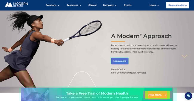
What We Like: Modern Health's website lays bare everything you need to know at a glance. It draws attention to the mission statement, while also providing social proof through spokeswoman Naomi Osaka.
In contrast to Modern Health’s content-rich site, the website for Cambridge-based low-waste shop Cleenland has no frills. The layout and design choices are simple to give prospective customers all the information they need when planning a visit.
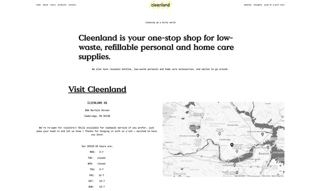
What We Like: This simple website design echoes the company's mission statement of reducing waste. Cleenland brilliantly employs white space to draw attention to the content that matters.
Whatever business site you’re trying to build, the most important thing is that you have a company website. When someone learns about your business and wants to know more, they’re likely to search your name online. When this happens, you’ll want your website to show up in search engine results, as it’s pretty much assumed any legitimate business these days has a website. If they can’t find yours, they’ll probably lose interest.
There are hundreds of solutions for building business websites (and websites in general), ranging from more involved and customizable content management systems like WordPress and CMS Hub to low-touch website builders like Squarespace and Wix. Business websites may also include ecommerce, blog, community, and knowledge base components as well, all to engage and convert visitors.
2. Ecommerce Website
Ecommerce websites sell products, be it physical goods or digital content. Visitors can browse the website’s listings, read up on product details, and purchase directly from the website. Ecommerce websites are focused entirely on retail, but business websites, blogs, and other website types may also host an online store for selling products or merchandise.
Ecommerce sites sell all sorts of things, but most stick to a familiar model — products are categorized and presented in a list format, and clicking an item brings users to a dedicated product page. Visitors can usually search for products as well via a search bar. On each product page, visitors can add the item to a virtual “shopping cart” or “shopping bag.” At any point users may enter the checkout process, in which they enter shipping and payment information to complete a purchase. Some website builders and hosting platforms even have different ecommerce specialties. For example, Blinkstore is a free website builder created exclusively for print-on-demand companies. It includes plenty of features such as product mockups, an order management system, shipping integration and more. These tools make it simple to build a professional-looking website with specific features catered for running a successful ecommerce business.
For an example of a visually engaging, informative ecommerce site, check out Briogeo Hair Products. Its pages capture attention with a rich pastel color palette to highlight its different products. The navigation menus include product thumbnails to reduce reading, and it displays its mission, results, and blog sections prominently alongside its shop.
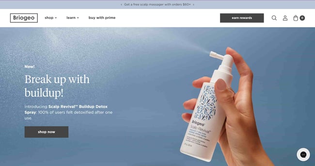
What We Like: This website boasts an exceptional design that seamlessly combines captivating visuals, intuitive navigation, and compelling storytelling to create an immersive and user-friendly experience.
Because ecommerce websites are often large, complex, and require infrastructure to securely handle payments and shipping, ecommerce platforms are a very popular go-to for new businesses launching online stores. Shopify is the leading option — for a monthly fee, it handles everything from site design to hosting to payment processing. Shopify also integrates with HubSpot to level-up your online marketing, sales, customer service, and analytics capabilities.
3. Blog
Blogging sites are difficult to define since their use has evolved so much over time. The blog (short for “weblog”) format began as a way for anyone to publish casual, long-form written content about their interests. Since then, blogging has been adopted by entrepreneurs and businesses to mark their presence online. Today, we can consider a blog to be any website that publishes written content in the form of articles (or blog “posts”) based around a topic.
If you’re an online business, a well-written, informative blog can be a major asset to your marketing strategy. It brings traffic to your site, establishes authority on search engines, converts visitors to leads, and eventually convinces those leads to take the next step to become customers. A blog that’s relevant to your business niche proves that you’re knowledgeable and committed to being the best in your industry.
If you need an example of business blogging in action, you’re looking at one. HubSpot writes four popular educational blogs — Marketing, Sales, Service, and Website — each filled with articles to help scaling businesses grow better.
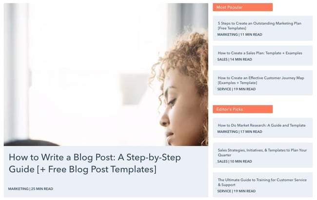
What We Like: As a blog website, HubSpot emphasizes readability, clean typography, and well-structured layout, ensuring a seamless browsing experience for readers.
Many individual bloggers have also found success, including Tim Urban. His blog, Wait But Why, explores topics in science, technology, philosophy, and math. Each post goes incredibly in-depth, so much so that you’ll forget the design is pretty standard WordPress. Still, this goes to show that quality content is king. I’d recommend starting with this mind-blowing post about the AI revolution.
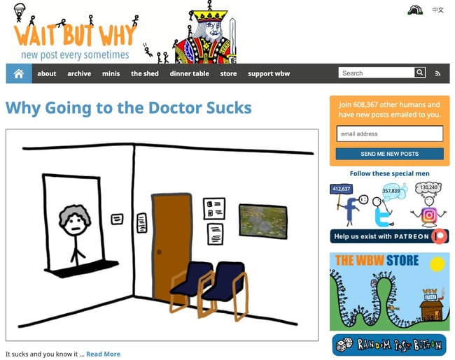
What We Like: 'Wait but why' excels in its unique design that combines entertaining visuals, relatable content, and seamless navigation, creating an engaging and immersive experience for readers.
Blogs don’t need to be part of a larger monetization push — they can be a simple way to share your passion. Most popular bloggers get their start this way. So, if you want to launch a blog to share your favorite pasta recipes with your friends and family, go for it. With HubSpot's free Blog Maker, you can have your blog up and running in no time.
4. Entertainment Website
Entertainment websites aim to, well, entertain. Like blogs, the content on these websites takes the form of articles. However, there’s usually a larger team behind these websites to produce content in larger volumes.
Take Reductress, a satirical news website that pokes fun at magazines and media targeted at women.
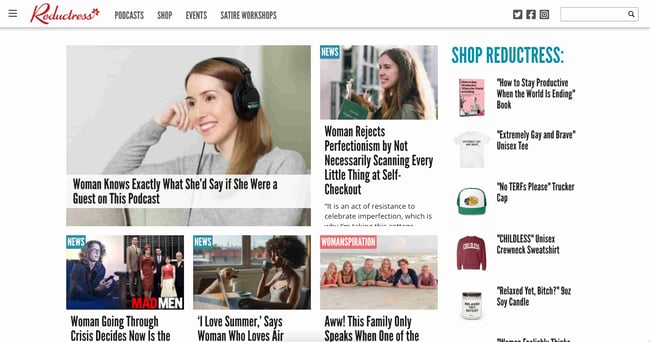
What We Like: The site’s design itself is modeled after the news outlets it parodies, right down to categorizing posts by topic, and pairs hilarious titles and subtitles with stock thumbnails to encourage clicks
You might have also heard of Pitchfork, a music review site that has been around since 1995.
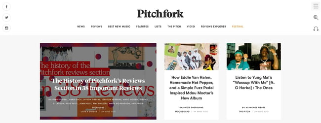
What We Like: Pitchfork has a cohesive, elegant frontend design, a sharp color scheme throughout, and clear navigation for everything the publication offers, including reviews, news, and its music festival.
Entertainment websites monetize primarily with display ads, sponsored content, and affiliate links, though they may also sell merchandise through an online store to supplement these forms of income.
5. News Website
News websites are like entertainment sites, but mostly comprise news reports. As such, these sites aim to inform more than entertain. News websites also tend to have a notably different aesthetic than entertainment websites, often with a cleaner layout and aesthetic. Take The New York Times — it heavily uses a grid layout to present the latest stories and typography to mimic its printed counterpart.
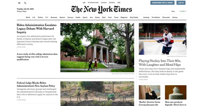
What We Like: Despite being renowned for its authoritative journalism, the New York Times skillfully incorporates elements of sleek design, engaging visuals, and user friendly interface to deliver an outstanding news website experience.
In place of on-page advertising, many news sites offer a subscription for access to their content. The New York Times limits the number of free articles users can view before they must purchase a subscription. Other online news publications place part of their articles behind a paywall, or limit the number of free daily articles.
6. Nonprofit/Organization Website
Websites are one of the best ways to establish legitimacy for a business, and the same can be said for nonprofit organizations and non-corporate entities. These types of websites serve to promote an organization, communicate the organization’s purpose, and often request and field donations.
Just because your site isn’t selling a product service, that doesn’t merit a shoddy design. To be effective, a nonprofit’s website must clearly convey its mission and goals from the homepage with emotional weight, with additional pages going more in-depth on individual projects and initiatives. Your site may also list organizations you’ve collaborated with, testimonials from those you’ve served, a calendar of future events, and a donation CTA to capture new contributors while they’re engaged.
Nonprofits can employ different design approaches too.
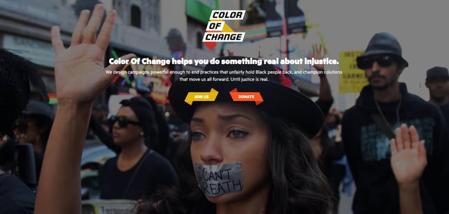
What We Like: Color of Change meets you with a fullscreen background image and clear CTAs on the first page. Visitors can scroll to learn more, but this design choice makes a strong first impression for new visitors and potential donors.
Take Southern Poverty Law Center, another American nonprofit as an example.
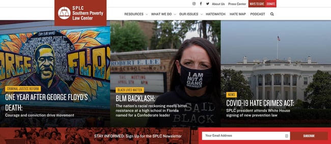
What We Like: approaches its homepage design like a news publication might, with image tiles corresponding to stories and updates. It also prioritizes a CTA encouraging visitors to subscribe to its newsletter.
7. Membership Website
Membership websites require visitors to register an account to take full advantage of what the site has to offer. These sites range from educational resources to web apps to news and entertainment publications. In all of these, some or all valuable content is protected and only available to “members” of the website and, in many cases, requires payment to access.
How exactly a membership site’s content and services are gated varies widely — some websites reserve all content for members, while other websites make some items free and others exclusive. Membership websites may accept one-time payments for access, be subscription-based, or require no payment at all, just a sign-up. Blogs, entertainment sites, and news sites have been shifting to this model to generate revenue.
Scott’s Cheap Flights is one example of an effective membership site
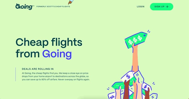
What We Like: The service finds inexpensive round-trip flights from the United States to popular travel destinations and sends an email alert when it finds a deal for you. Users must create an account to use a service. Then, they can enjoy its free offerings or upgrade to a premium membership for access to more offers.
8. Portfolio
Online portfolios are a great way for creative freelancers and agencies to present their work. Whether you specialize in painting, illustration, film, photography, graphic design, sculpture, prose, or poetry, you can craft a portfolio website that showcases your creative best.
Portfolios are also an option for professionals outside the arts — for instance, programmers can build portfolios for their coding projects, and marketers can use portfolios to recount their most effective campaigns.
There are thousands of portfolio websites out there to inspire yours. France-based freelance designer Julie Guzal’s is just one example.
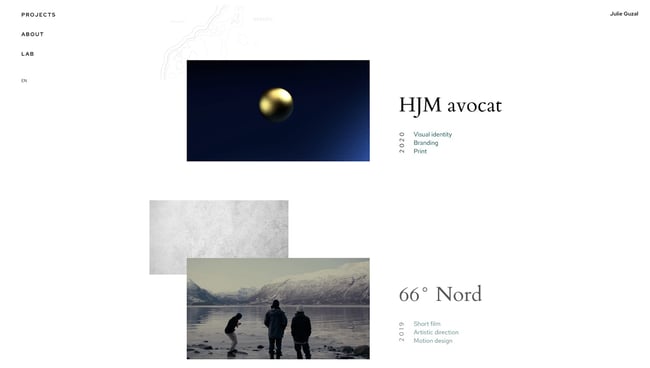
What We Like: The minimalist, broken grid layout places focus on her body of work, with several small design quirks to make it memorable. There’s also a prominent (but not distracting) contact button near the bottom to get in touch.
Musician websites are another great reference for innovative design. The band Japanese Breakfast updated its site’s visuals to accompany an upcoming album release.
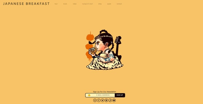
What We Like: Again, we see a prominent CTA on the homepage, with subtle links to view their music, tour dates, and more.
Since creative professionals and agencies utilize portfolios to land work with clients, these sites lean more formal in their presentation. For a more casual approach, you might consider a personal website, which we’ll cover next.
9. Personal Website
A personal website is all about you. Use it as a medium to express yourself and your thoughts through writing, projects, visuals, or media, as long as it reflects your unique perspective.
The goal of your personal site is also up to you — if you want to use a personal site to advance your career, you could post your resume detailing your work experience and consider adding a bit more visual flair than a plain PDF file. If you’re an entrepreneur, a personal website establishes your personal brand. Or, you might just need an online space to vent your ideas — doing so has never been easier.
As one example, the personal site of front-end developer and designer Fatima Burke exemplifies a more professional take on the personal site, listing skills, clients, projects, and products.
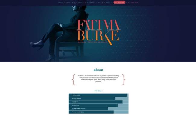
What We Like: This website is great as a personal resume, as it immediately displays the about section and key skills in an easily digestible manner.
10. Forum
Forums are online spaces for people to discuss things that interest them. They consist of message boards for different topics and moderators to ensure things stay civil. If a visitor wants to participate in your forum, they’ll register with an account first — membership can be free, or you can charge for it.
While forum websites certainly exist on their own, they’re also valuable as an extension of an existing site. For example, an educational website may include a forum where students can chat about courses and answer each others’ questions. Community platform app Duolingo does this, with a section for forums, blogs, articles, wikis, and more
SaaS companies also often leverage forums as a support resource. Products with strong developer communities are invaluable in lowering the learning curve of a product — as are knowledge bases, our final website type.
11. Knowledge Base
If you run a business, you can bet that your customers will have questions. To get out ahead, you can create a knowledge base, a website that contains documentation and answers to common questions about your product or service.
Knowledge bases sort their support resources into hierarchies, making them easier to navigate and find what users need. Knowledge bases are typically also searchable — the fewer obstacles between you and your desired resource, the better. Plus, you can analyze your visitors’ search queries and reshape your product to better address needs. This all works to decrease the number of support requests and makes for a frictionless experience.
Again, we can look to HubSpot for a model of what a knowledge base can be. The HubSpot knowledge base provides answers to product-related questions and guides for every feature. Easily searchable, our knowledge base lets you filter queries by resource and see your location on the site with breadcrumbs.

What We Like: The neat layout that emphasizes the search bar and different sections with accompanying pictures will keep visitors coming back.
What’s your website?
Now that we’ve reviewed the kinds of websites that are out there, you hopefully have a better idea of where your future site falls and what conventions you can adopt. Narrowing things down a bit and finding your niche narrows your options, helping make the design process much less intimidating and time-consuming.
It’s also good to know that your design doesn’t have to reinvent the scroll wheel to make an impact — reference the above examples as a jumping-off point, and check out our Website Inspiration Lookbook for even more case studies in web design.
Different browsers-dates and popularity:

We all know the basic functionality of the browser — it’s what connects you with everything on the web. Your browser allows you to shop online, watch videos, upload pictures, play games, and billions more. More technically though, the browser is a software application that retrieves and displays information from a server including web pages, text, images, videos, and other content. But that’s just the beginning.
Why do different browsers respond differently to websites, and why is there more than one to begin with? How do browsers work and where did the need for cross-browser testing come from? By understanding the history and backend of some major browsers including Chrome, Safari, Internet Explorer (IE), Firefox, and Opera, it’ll be easier to understand what goes into developing and testing a cross-compatible website.

Browser Timeline:
There’s an entire history of web browsers. Before the web browsers we knew today, there were the first browsers, which are no longer in use or have highly evolved.
1990 – The WorldWideWeb (not to be confused with the World Wide Web) was the first browser ever created by W3C Director Tim Berners-Lee, then renamed Nexus to differentiate from the actual World Wide Web. Unlike today, this was the only browser and the only way to access the web.
1992 – Lynx was a texted-based browser that couldn’t display any graphic content.
1993 – Mosaic was the first browser to allow images embedded in text making it “the world’s first most popular browser”.
1994 – A noticeable improvement to Mosaic came Netscape Navigator.
1995 – Internet Explorer made its debut as Microsoft’s first web browser.
1996 – Opera started as a research project in 1994 that finally went public two years later. This was also arguably the beginning of the browser wars, mainly between IE 3 and Navigator 3 as Internet Explorer inched ahead with new capabilities.
2003 – Apple’s Safari browser was released specifically for Macintosh computers instead of Navigator.
2004 – Mozilla launched Firefox as Netscape Navigator faded out.
2007 – Mobile Safari was introduced as Apple’s mobile web browser and continues to dominate the iOS market.
2008 – Google Chrome appeared to soon take over the browser market.
2011 – Opera Mini was released to focus on the fast-growing mobile browser market.
2015 – Microsoft Edge was born to combat Google.
Modern Browsing:
Today, Chrome still rules desktop browsers while Safari owns the mobile browsing market. However, there still is no defined winner. The browser wars are still going strong and fragmentation is a more prevalent issue than ever due to the frequent updates and releases of different browser versions and operating systems.
Browsers preferences are also largely dependant on demographics including age, country, and even job. For example, many schools and companies have certain requirements about what devices, operating systems, and browsers users may access and don’t permit individuals to update on their own.
Additionally, as browsers continually update versions hoping to be the next Google Chrome, there’s no saying when one will finally surpass its popularity or when another company creates their own browser to enter the mix. In fact, with Firefox’s recent Quantum version, more and more users and considering making the switch in favor of a faster browsing experience.
Not to mention, the underdog browsers still capture a distinct user base. While something like UC Browser might not capture a large percentage of the internet in comparison to the big five, it still serves about 500 million people.
So, what lessons can we take away from the history of web browsers? As software professionals, the only sure-fire way to approach this diverse user behavior is to develop web applications to be cross-compatible and test them across different browsers to make sure they’re visually and functionally acceptable.
My hand drawn timeline of the WWW:


Context: The aim of my website is to inspire and enable lifelong giving.
On my website pages, i would like a color scheme of purple, blue, and green.

Purple is cheerful–whimsical and playful. It’s associated with an escape from reality and magical images. Purple is often a statement of independence as it’s not abasic, primary color, and it’s often a sign of fusing the mundane with the innovative.
We associate green with vitality, fresh growth, and wealth. We generally think of it as balanced, healthy, and youthful. We use green in design for spaces intended to foster creativity and productivity, and we associate green with progress–think about giving a project the "green light".
While blue conjures images of sky and sea, it’s also the color of bravery and dedication. Blue represents introspective journeys and symbolizes wisdom and depth of understanding. The aqua and turquoise found in Caribbean waters typically engender positive feelings, and the blue of police officers’ uniforms call to mind protection, bravery, and loyalty. Blue is associated with peaceful rest, profound insight, and spiritual realization. Professional uses of blue carry connotations of stability, wisdom, and serenity.
When you are inspiring and enabling lifelong giving, you want a family-friendly environment on the website with clear navigation and lots of pictures to show what the company is all about, and across London, i want to inspire giving. Being kind or helping others isn’t something that just happens automatically. It is a mindset that needs to be taught, nurtured and encouraged, so that present and future generations are imbued with this core belief of Judaism.
I am planning to have a mix of all three colours on each page, not one colour per page separately, it wouldn't look professional and it might have bad readability. Having 3 colours on the website not over shing each other but a good mix of all three will look appealing and have meaning to the colors i chose, which is what i said above.
Basic elements that i want and need to include in my website in order for it to have good and efficient framework in my website. I want three pages that are the most important on my website that i will create and these pages will include a home page, a services/products page, and a contact page. On my homepage, i want to include a clear navigation bar at the top of the page and i want all my resources to be present on my website to show people how they can donate and have history and reasons why we do this and what we wish to achieve with a clear vision , with my images i have taken myself included underneath the navigation bar with moving images showing a variety of what my website has to offer, from wonderful volunteers and generous supporters (through them, we are able to inspire and enable lifelong giving, creating a community that is engaged, supported and empowered by the gift of giving to achieve a community that is generous and shows the epitome of the name of my website Firgun . My main inspiration for my planning and framework and style is the GIFt website as itsv exactly n what i want to achieve through my website as well, but i want to do what they do without copying them, but the whole topic i picked of community is heavily inspired by GIFT and what they already do because i think they are amazing and its important for the jewish community and for everyone in the world to be kindd and show generosity and volunteer and do your part to inspire gift giving and kindness to people of all ages in different living situations, from visiting elderly people in a care home and bringing them home-cooked meals, to giving families in London foood packages with the basic essentials of toiletries and food and water to get by each week and inspire gift giving and volunteering and delivering food parcels tro houses or just donating to my website. Donating to my website is just as important as the in-person volunteers themselves because the money you donate helps go towards providing and keeping the Firgun business going for the benefit of others and showing generosity, which is what we need more of in the world . My buisness will make a change in the world in the area of London and all the small things we do to help those in need will make a difference to many lives with the charity we do to help others.
1 Navigation: The website design should be easy to navigate and the menu items should easily accessible from any page. The viewer should always know exactly where they are on the website and have easy access to where they would like to be. A site map is a great idea and will be used if available. This sounds elementary but most websites could be improved in this area. Remember, there is a fine line between an interactive menu and an annoying one, so functionality should be the idea.
2 Visual Design:People are visually oriented creatures, and utilizing great graphics is a good way to make your website more appealing. Your website has about 1/10th of a second to impress your visitor - and potential customer - and let them know that your website - and business (by proxy) - is trustworthy and professional. However, it's important not to go overboard with too much. Scrolling text, animation, and flash intros should be used sparingly in your web design and only to emphasize a point for maximum effect.
3 Content:This is the backbone of your website. Not only does your content play a major role in your search engine placement, it is the reason most visitors are seeking from your website in the first place. Your website text should be informative, easy to read, and concise. Well thought out web content and copy will do more than anything else to make your website design engaging, effective and popular.
4 Web Friendly:No matter how informative, beautiful, and easy to use your website design is, it's useless unless it's web-friendly. It is important that your web designers know the keys to making your website work on all the major browsers, and that they utilize meta tags, alt tags, are fully versed in SEO (Search Engine Optimization). Many factors effect your search engine placement and visual appearance of your site, so make sure your web designers know their stuff.
5 Interaction:A truly effective website design engages your visitors immediately and continues to hold their attention through EVERY page, as well as influences them to contact you. This is called 'conversion', and is probably your website's ultimate goal. Again, there is a fine line between ʻinteractionʼ and ʻannoyanceʼ, so the level of interac- tion should never outweigh the benefit.
6 Information Accessibility:Not all visitors to your website are interested in, or have the time to peruse the entire site. They may need to access only a phone number or address, or just a certain bit of info. For this reason itʼs important to place key information in plain site, in an area thatʼs easily accessible. Weʼve all had the experience of not being able to locate some needed information on a website, and the result is always a frustrated visitor. The experience is annoying at best, and a disgruntled visitor wonʼt stay on your site very long and is unlikely not to return, much less do business with you.
7 Intuitiveness:A great website anticipates what your visitor is thinking and caters directly to their needs, and has elements arranged in a way that makes sense. If a visitor is searching for one of your products or services on a search engine or directory where your site is listed, it's important that your website have a landing page that is directly relevant to what they searched for rather than forcing them to filter through all of your information. Remember, the shortest distance between two points is a straight line.
8 Branding:Your website should be a direct reflection of your business and your brand. Your visitor should immediately make a visual connection between your logo, print material, and brick-and-mortar location. A website that does this not only contributes to the memorability of your branding, but adds a level of credibility and enhanced image of that of your overall business.
9 Turnaround Time:The number one complaint of website design customers is the time it takes to get the site up and running. Unfortunately, a firm that takes unusually long to complete your website is par for the course. The longer it takes to complete the website, the more business - and value - you lose. A website that isnʼt on the web isnʼt and working properly isn't going to bring you any business!
10 Conversion:Your website can be the most important client generator your business can have, and must place the primary emphasis on bringing in new clients and making additional services available to existing clients through increased awareness of all the services you offer. Providing them with the tools they need to do business with you in an easy and enjoyable way will increase your website conversion and bring you the kind of success you seek.
Hand-drawn Illustration of how i want my website pages to look like.


4. Consider the Assets and what you should include in it and make it effective:


Secondary reaserch: Competitors and industry trends

industry trends in non profit volunteering organisations-Formal volunteering has fallen by 40% and informal volunteering by 20-30% since 2013/14. This trend seems to have accelerated since the Covid-19 pandemic, despite a small spike in informal volunteering in 2020/21. The most common reasons why people volunteer are: “I wanted to improve things/help people” - 48%.

Building my final website process:01.12.23,04.12.23,08.01.24
This is a link to my final finished and published website -https://poppygoldberg13.wixsite.com/firgun
I am not finished but for now, i will put the link here if anyone wants to see what I've done so far. I published my website and have started adding the basic features like images and navigation to the homepage of the website and i have also started making my second page for media from my website. I will screenshot any pages i have to think I've finished but will probably change to show my progress, experimentation, and reflection throughout the process of making my website on Wix.


This is how my 'homepage' on my website looks so far, its not finished but so far i have added a navigation bar and ,my websites colour scheme and images and other key bits of information at the bottom of my homepage. I will probably change the type on the navigation to a darker colour it has better readability on the green background.


 |
| this will be at the bottom of each page on my website |


This is what i have on my 'contact' page so far.


This is what i have on the 'about us' page so far and its definitely not done yet.


I have a few more pages that I'm also working on but for now this is some progress i have made and i will carry on adding and making my website look good. The functionality and navigation of my website so far is good and easy to use and i am doing this all on wix for free using the communities Non-Profit Website Template to help me and make it easier to create my websites layout, without me having to do it with no help template would be too time consuming and hard. My website is completely made and designed by me using a ready made template , not using AI to auto fill parts of my website, i am custom designing and adding all the information and pictures and other key website features myself. I want all the images on my website to be all my own original imagery. I might delete 'News' from my navigation bar as it might be needless to have and i don't want too many pages on my website, so ill consider deleting it from my pages as i don't think i need to have a latest news page as i already have a 'press and media' page.

Update: i have finished my whole website and published it for anyone to see on desktop and mobile view. To see my website you can click the link i put above.


(user experience) and UI (user interface) basics for mobile apps: App prototyping on Adobe XD reasearch:04.12.23
Adobe XD doesn't make make your app, its helps you start prototyping the app.

Mobile app UX design encompasses the experience of users before, during and after they use a mobile app. User experience (UX) refers to the user's journey when interacting with a product or service. UX design is the process of creating products or services that provide meaningful experiences for users, involving many different areas of product development including branding, usability, function, and design. UX design involves far more than the visual components of the UI. In mobile UX design, the focus extends beyond mere visual aesthetics to encompass the emotional responses, objectives, and obstacles faced by users. Good UX design can make or break your business’s product and customer relationships. Because of this, products are more people-focused than they’ve ever been. Today, best practices include answering JTBD (jobs-to-be-done) or customer needs, accommodating diverse people, offering easy-to-use interfaces, and delighting users at every step of the journey. UX design involves far more than the visual components of the UI.
In mobile UX design, the focus extends beyond mere visual aesthetics to encompass the emotional responses, objectives, and obstacles faced by users. Good UX can help toward critical product success metrics. 90% of users have stopped using an app due to poor performance. A great experience can not only deter someone from leaving, but it can encourage them to use your app even more.

Usable: The system must be as easy and self-descriptive as possible.
Desirable: The style of the system must evoke positive emotions and appreciation. Users must want to use your system.
Findable: Navigating through the system must be easy and self-descriptive. Moreover, users must find important information quickly.
Accessible: Disabled users, e.g., users with very poor eyesight, must have the chance to use your system and get the same user experience as non-disabled users.
Credible: Users must trust you and your product.
- Conduct user research to understand their target audience and their needs.
- Create user personas and scenarios to guide their design decisions.
- Use a mobile-first approach, prioritizing the most important content and interactions for the mobile experience.
- Use responsive design to ensure that the design adapts to different screen sizes and orientations.
- Pay attention to the visual design of the mobile UX, using a consistent color palette, typography, and imagery.
- Use appropriate visual cues, such as icons and buttons, to guide users through the interface.
- Consider the use of animations and micro-interactions to enhance the user experience and provide feedback to users.
An example of a good UX is Todoist. Todoist have a wealth of features to help people manage their personal or team tasks. The app is easy to navigate, drag and drop-friendly and gives you that ingrained sense of gratification when you cross a task off a to-do list.
However, the UX design example we particularly want to call out is Todoist’s recurring due dates. It’s a simple feature that showcases Todoist has really done their user research and identified one of their users’ key tasks.


User interface (UI) design or user interface engineering is the design of user interfaces for machines and software, such as computers, home appliances, mobile devices, and other electronic devices, with the focus on maximising usability and the user experience. Truly great UI achieves all this and more. Exceptional user interfaces won’t just facilitate the seamless achievement of the task at hand—they’ll also be aesthetically enjoyable for the user to navigate. UI can be versatile and good UI design can be achieved through effective UI design that captures users’ imaginations while keeping usability at the forefront.
By keeping the critical user interface design guidelines for mobile applications in mind, you will be able to save the time and cost that would go behind revamping the app again and again. Furthermore, the initial time investment in Android user interface design or iOS app user interface design can lessen challenges during and after the launch. The purpose of a good UI is to make the content engaging and navigation less complicated. It helps the user understand the app flow easily, thus increasing satisfaction, and ultimately building a good market value and surpassing the competition. For example. Amazon has one of the cleanest Android/iOS user interface elements as products are easily navigable, and the application is very user-friendly.

Another example of a good UI design is Pinterest’s waterfall effect. What would a UI design examples inspiration blog post be without a nod to Pinterest’s iconic user interface? As bonafide card design pioneers, Pinterest combines card design with a waterfall flow to provide users with a uniquely smooth and seamless experience.
By giving each card a subtle shade when interacting with the mouse, Pinterest has smartly enhanced visibility and given the elements the perception of “clickability.”

 |
| Example of a seamless UX/UI Design |
What is best practice for mobile app design?
No Web Experiences: Don't replicate web experiences on an app. Users expect certain interaction patterns and interface elements in mobile apps. Maintain visual consistency with the colour palette, typography, and all other design elements. Provide seamless experience across all devices. Don't replicate web experiences on an app. Users expect certain interaction patterns and interface elements in mobile apps. Maintain visual consistency with the colour palette, typography, and all other design elements. Provide seamless experience across all devices. It also builds trust with the brand. Avoid using underlined links, instead use buttons. Don't take users to a browser.
This increases abandonment and reduces conversion. Avoid creating dead-end pages that act as blockers for user flow. Error states and empty states should provide instructions and actions to move forward. Design for glanceability and quick scanning as user behaviour. Glanceability refers to how quickly and easily the visual design conveys information and finally, Make sure your product works when it isn’t connected to the Internet at all. Allow caching of data.
XD and app prototyping:06.12.23


Apps continued- showing interactivity: 13.12.23


Mindmap for my app brainstorming ideas for my app:

Below is everything on my mindmap if the image text is not readable:
Mindmap Map-brainstorming ideas
What is
your main ideas for my app?
What is
your main idea?
What is
your main idea?
What is
your main idea?
Consider what your app might provide/do:
As i am sticking to the same concept and idea for my area of investigation of community in volunteering, i will keep the name FIRGUN as my apps name .
Break the main
idea down into categories
An app for the purpose having volunteering events and volunteering gigs easy and accesable through my app and can easily book a free volunteering job out of your time and generosity to help others who need your help in the jewish community.
Break the main
idea down into categories
This app is not to sell anything, its an app i want to create to be an easy way to support and raise money for charity through my app for people in need.
My app will be to inform my audience/demographic about the importance or volunteering
My app will not be for entertainment purposes for quiz or trivia for example.
Supporting Idea
Another idea is that this app could educate the jewish community on the core values of jewdaism and how we can imput that into our daily lives , with my app offering pages to direct you to booking onliine interactive zoom sessions or in person to learn more about the core values of jewdaismn m and how we as jews can support and community through the power of volunteering and genersity.
Supporting Idea
My app will have the aim for people to be encouraged to do lots of gift-giving foward and volunteering .
Out of all my ideas, i will pick one that is most suitable for an app.
The users on my mobile app will be able to found out why you should volunteer to FIRGUN and how you can donate through my app and read peoples stories of real-life experiences thety had of how volunteers imapcted their life through gift-giving and gicving a helping hand and showing generosity towards the npeople in need , who gwt support from the volunteers through theire actions to help the people in need in the jewish community strive.
Supporting Idea
I will reaserch a food banlk website called the trussels trust and look into their app to give me ideas for my own app about volunteering and giving back to the community and donating food essentails , to their food bank.
It will be about raising money and donations for FIRGUN for a large audience for volunteers to get involved in helping the community and when people donate through my app, it will help many people in need in the jewish community .
Supporting Idea
Another idea that i came up with is for my app to be just for the purpose for people to easily donate anytime they can to my mnon-profit organisation FIRGUN
Supporting Idea
Add supporting factor here
Add supporting factor here
Add supporting factor here
An idea that i really like is that through my app, anyone who wants to get involved can book a volunteering gig at anytime free of charge and also through my app, i want people to see all the fundraising events FIRGUN offers weekly on a consitant regular basis, to help promote and book your place at the event as a helper/volunteer to help encourage people to come and donate money at the events for people in need and FIRGUN will be partnering with local jewish charities to show that its a real event that is working side by side withh a real charity organiusation to help for example children in need or families who need essentials delivered to their homes, or even monety donated to buy freash ingrediants to mmake fresh home baked catred meals for elderly jews who need your support and generosity .
The app could work with links on one page leading youn to a page of contact on how you can becme a volunteer at FIRGUN , with for examplle a link to a contavct number or a link for where people can click it and be put onto the page for collection of food parcles and how you can get different volunenteering positions and what ones area available , and my app will inform people of opportunities they can take on and book it through my app. Or my app might not end up having any links at all and might just be about the imporance of volunteering and peoples stories and one small link on my apps main a page leading you to a donate page.
Add supporting factor here
Organize your ideas - from the broadest concept down to the smallest details
Another idea that i came up with is for my app to be all about showing diofferent peoples stories about how volunteers helped them be where they are today and really helped them and provisded the essentials to help them get out of a tricky situation in their life . After reading peoples stories through my app, they can then click the link or scan the qr code on the apps homepage to direct them to a page on the app where they can donate or at least become a volunteer themselves, or share our page to many others , who can donate and spread the message of my app of my non-profit organisation trying to raise awareness of the importance of volunteering and how it positivley impacts the community and can change peoples lives in an extrodinary way, through inspirational stories on my app on one page and events on another page and a page all about the importance and making people aware of how volunteering impacts a community in a healthy and great way.
Creating a Mood board: colours, image ideas, buttons, logo inspiration,typeface style:
- Fonts are part of the main cast for user experience. Choosing the right font will make potential for user involvement with the web or mobile app even bigger.
- The smallest example is, when the font we choose for a news application is correct, it will encourage users to read it easily.
- If users are easy to read, they will be enthusiastic about the news. They will leave comments, share with their friends, and much more.
- It’s different if the font we choose is not right for our mobile app.
- So the user will have difficulty reading the information and it is not easy to understand what the application wants to convey.

Research an app: Justgiving
Analyse at least one app that have a related function/theme, include
images
• What do they do?
• What is the visual appearance of them?
• Why would they appeal to their target audience?
• Compare them and give your opinion
• What parts can you emulate or adapt to suit your app?
The just giving app is a bit bland, so i will research one more app that relates directly more to donating and volunteering, not an app like just giving which is basic and a genetic app, so i will research another app which is more specific to my app which is more formidable, than the just giving app. Just giving is bland and not appealing and it doesn't give people reasons for people to get involved. They dont have charities involved with them and the app is not visually appealing or colourful and wont draw the viewer in. Justgivings had no pictures and was a dull app that didn't fully relate to my app idea.
Justgivings app Provides direct support to an individual, family or community by paying medical expenses or offering financial aid. JustGiving is one of the most popular peer-to-peer fundraising platforms and is ideal for challenge events, allowing donors to sponsor their friends and family. With the JustGiving app for Beacon, you can rest assured that all of your data is automatically imported into your Beacon database, structured and stored in the way that's right for you.
Features
Fundraisers import
When a supporter creates a new fundraising page for you in JustGiving, Beacon will automatically add them and their page as records in your account.

Donations import
When someone makes a donation in JustGiving, Beacon will automatically add the donation as a Payment in Beacon.
If the donor allowed JustGiving to pass their data to your organisation, then the donor will automatically be added as a Person in Beacon, allowing you to see the history of all of their payments in your database:

Additionally, Beacon can import the fundraiser responsible for each donation, setting them in the 'Fundraiser' field on the payment record. Helpfully, this allows you to quickly see how much a person has fundraised for you when viewing their person record:

Events & appeals
When importing fundraising pages and donations, Beacon will create events in your database for the JustGiving events that don't already exist in Beacon:

Beacon will also create a campaign in your database for each appeal you have in JustGiving, allowing you to easily keep track of the donations made across each one:

1. Create a JustGiving app
First up, you need to sign up for a JustGiving developer account.
Note: This is different to your regular JustGiving login.
Once you've created an account and verified your email, head to My Account > Applications.


You'll see that JustGiving has created an app already for you:

Woohoo! We're not done yet though...
2. Get your app approved by JustGiving
For this app to be used with Beacon, it needs to have it's "plan" changed by the JustGiving developer team to allow access to JustGiving's API.
Open your app, and then click Review/Change:
This should open a popup. Then click the Beacon CRM integration link on the left hand side, and then scroll down and click Request plan change.
After you've requested a "plan change" with JustGiving, the JustGiving developer team will review your request, and should grant you access within a few working days. You'll be notified by email when this happens.
3. Add your details into Beacon
Now you have your approved JustGiving app, you can connect with Beacon! Head over to Apps > Directory and click Install on the JustGiving app.

You'll immediately be prompted to connect with JustGiving:

When connecting, you will need to add your Charity ID (can be found in your regular JustGiving account Settings > Edit Charity Details):

You'll also be asked to provide your "App ID". This is for the developer app you just created, and can be found in your list of JustGiving developer applications:


The email and password fields are the usual details that you use to login to JustGiving with (not the developer details).
Once you've entered all of the details, click Connect. Review the settings and then click Save integration.

Nicely done! JustGiving is now connected to your Beacon account!
JustGiving app is forward-looking. It only imports donations that are made after the JustGiving app is installed, and only imports fundraisers for fundraising pages that are created after the JustGiving app is installed.When someone has created a new fundraising page, JustGiving sends their details to Beacon overnight (around 5am!) so you should see any new pages added as Fundraising pages and fundraisers themselves added as People within 24 hours.If a donor or fundraiser opts-in to provide their data to you in JustGiving, the data will be available for Beacon to import. They allow you to choose how to set contact consent for imported donors and fundraisers (which depends on your consent statements in JustGiving). Jamie Parkins is the API product manager at JustGiving. He specialises in developing the services and technologies that enable charities, agencies and a growing community of developers to build applications that utilise JustGiving's technologies.


The app has been built using JustGiving APIs, so charities don’t need to do much to get started.


  |
This is the Go fund me logo, its bold and effective and not boring but is 1 plain colour which is fine because its very eye catching and has a nice light green colour. Go fund me is available on all devices and it is a popular page for people to raise money online. Its not exactly what my app is about , but it has some similarities and the visual appeal of this app inspires me and i might use some of the aspects of this app onto my designs, in my own way. GoFundMe is the No.1 and most trusted leader in online fundraising/crowdfunding. Since 2010, we have helped people in over 170 countries raise more than $5 billion. Start or manage fundraisers, engage with supporters and discover important causes on the go with the GoFundMe app. |


 |
To support independent businesses affected by the coronavirus pandemic, Yelp and GoFundMe teamed up to make it possible for people to donate through the businesses' Yelp pages.   |


This app layout is the latest mobile UI design trends. Go fund me is a perfect example of this and the screenshots above just show how good the layout and colour scheme of the app is.


My sketches for my app layout:


I have drawn a detailed sketch of 6 pages for my app of how i want my pages to look like, with its context and layout. My apps pages will all have pages that relate and link to community in volunteering. The pages with more content will be scrollable and i wont make them crowded on each page, so its readable and readability is a very important aspect of each page on the app. This will be an app for the purpose for people to donate and have volunteering engagement and to encourage gift-giving forward . My pages each have a navigation bar and i decided to put it on the bottom of each page on my app , instead of the top because it looks neater and it will look good on a phone format. To link my pages, i will have a homepage, collection page, landing page, Info\contact us page, our vision page and a support page. I want the events buttons to link to my info page possibly and the education button to link to my vision page and the volunteering button to link directly to the support us page to encourage people to become eager volunteers and support my non-profit organisation FIRGUN.
For the user, my app will provide a place for people to become volunteers and learn more about the volunteering community and possibly donate or do anything you can to help. My app will have images for users to show what we do at FIRGUN and if you become a volunteer this could be you and i want my pages and app to encourage people to be generous and inspire gift-giving in a kind community who supports each other and helps those in need. I want my app to work with charities and be known because the more attraction my app gets, like GOFUNDME, the more people become volunteers, become educated and donate and make a change in the world through gift-giving and generosity. Desirable functions on my app will be the ability to become educated on the power of volunteering and even become one yourself, and if you cant just donate and it makes just as big as an impact for people in need. I will create my app on adobe XD and create frames to start off then the details inside like navigation and other key features about my pages. I might use another app making website but make features on that but paste it into adobe XD and primarily do most of the creating and designs on adobe XD.
Creating my app process: 20.12.23
I am adding my masthead from my magazine cover and reusing it onto my app , since their already related about the same thing on volunteering in the jewish community.


I have not yet added my links to each button on the app, but i will do that next lesson.


Below are my usability testing and actions i want my users to perform based on my questions that i will distribute to other people in the class to answer and give me feedback on:
- Objective questions are those based in fact, where a respondent's answer can be determined as right, wrong, true or false. An example of an objective question would be to ask where someone lives or what they bought from your store.
- https://freeonlinesurveys.com/survey-research/types-of-survey-questions#:~:text=Objective%20questions%20are%20those%20based,they%20bought%20from%20your%20store.
- Subjective questions aim to measure a respondent's feelings, attitudes and perceptions of something. For example, how they felt about the quality of customer service or what their favourite brand of coffee is.
- https://freeonlinesurveys.com/survey-research/types-of-survey-questions#:~:text=Subjective%20questions%20aim%20to%20measure,favourite%20brand%20of%20coffee%20is.

The feedback I got from 4 members of the class:


Before changes:

After changes:


After changes:


- Low domain authority
- Insecure link
- No follow links
- Irrelevant or harmful links
- Link spam
- How to Use Outbound Links
- Now that you know the benefits of outbound links and when they are useful, let’s take a look at how to use them.


No comments:
Post a Comment