Mise en scene PowerPoint work: 16.10.23
Task 1-For each image answer the following questions:
1. What type of lighting is used in each image (High or Low- key)
2.What effects/meanings does the lighting suggest?
Extra challenge: Where are the key lights, filler lights and back lights in each image?


Low-key The effects of the lighting in this image is the way everything is laid out from the candles to the way they are seated near each other, which is tense, eerie, and mysterious due to the uncertainty of what is about to be said. The dim lighting on everything except the light coming from the candles and the mini light in the corner suggest that there is key lighting on the girl, filler lighting on the mini lamp in the corner and overall dull back-lighting, to show a tense lighting set out on purpose so us as the audience viewing the image can clearly see the tension and emotional strain the conversation is putting on the family, but especially the girl in the middle.
The setting gives the effect that the girl in the middle is in trouble and is being yelled at by her parents, and she doesn't want to be there and the overall body language screams uncomfortable, yet the spotlight in this image is all riding on the girl and what about to happen to her. The food on the table suggest that its a family interaction, not strangers and i get the impression that they are strict parents who are very hard on their child, putting pressure on her to be perfect and put her in the spotlight, when clearly, she isn't there by choice, she is there from the fear of making things worse if she doesn't corporate with want her parents want/expect from her.

Low-key light- The effects of the lighting in this image convey that it's dark and ominous and that something bad is going to occur at any second. The lamp is a key light source in the image and shows that the man in the reflection is giving the impression that the man is very frustrated and confused. The body language in the image shows what is expected to come his way.
C.


E.

The setting and lighting in this scene is High-key lighting. This scene has two men and a woman who looks to be in an abandoned alley near a kitchen for a restaurant. To me, it looks like these two men are desperate and are struggling in a tough spot and need their old kitchen jobs back, but the owner is kicking them out and you can tell by her facial expression that she is annoyed and is fed up with their antics and that she doesn't want them back working under her restaurant.

write about every element from mise en scene on each image:
props, setting, location: then apply it


1.

2.


7 Typography Rules & magazine design tips:16.10.23(Typographic rules for magazine design)
Typography rules. These practical examples and techniques in In Design will turn you into a real typesetting maestro.
clear entry points:
Clear entry points help readers be engaged and start reading the content. Indents on all the paragraphs is a good way to separate the block of copy and you should use either indents or spacing paragraphs. You should avoid using the indents on the first paragraph. Using first line indents helps create a visual separation. Drop caps create nice entry points. You can use alt or option right arrow (alt/opt+right arrow) to move the text further away from the drop cap and its the same shortcut for kerning and tracking.

line length(measure):
Line length is also referred as measure in typography is important. Line length means each of your lines should always be between 45 to 90 characters and that includes spaces as well. You can check this by triple clicking on the text which will select a single line. From the window menu you can go into the info panel and there you will see exactly how many characters you have. To keep it between 45 to 90, you need to widen the columns or text frames. You select the whole text frame, then type in 65 for width value, and you do the same to the right side. You then drag them apart a bit, but if your working with grids, you would have to align this to your grids aswell. If you want to cheak the range from before you select the grid. Its important to pay attention to measure to mainly improve the readability of your text. Readability means the convienience of reading. You shouldnt make your text uncomfortable to read. Having lines Over 90 is a bit too long and is uncomfortable to read because you have to jump a very long distance from the end back back to the beginning and similarly, if its too narrow then its just going to be constantly jumping back and forth between the the two sides of the column, while reading.

Align:
You can be creative with the alignment of the text but theres a couple of rules. Firstly, align left or flush left is the most common way of setting type and also justification is very commonly used. The main difference between these is that with justification you get completely strait edges on both sides but you need to be careful with justification. With justification, you end up creating rivers in your text, especially when you have a narrower text frame, if you apply justification on the text by pressing command or shift J (cmd/ctrl+shift J), you can see bigger gaps appearing within the text, it gets worse if you make your text frame smaller or more if you remove hyphenation. If you go on paragraph settings, you can remove the hyphenation and its even more visible that there are some bigger gaps within the text. You sometimes might not notice them, so a good technique to double check your text is to turn it upside down, so its easier to find them. The way you can avoid these rivers appearing in your text is to only use justification on line length higher than 60 characters and also make sure that allow hyphenation, because that will also reduce these unwanted gaps. You should only use the flush right or align right option when there is a reason to do so. Left align or flush left is usually a bit more readable or convenient for your readers. Whenever you are using flush left or flush right, you can also apply the balance raged lines option, which can also be saved as a paragraph style feature. You can find it in the additional options, when using the type tool and there is balance raged lines. The raged line can get a little bit more organised when this feature is enabled.
Below is before the Balence ragid lines feature is enabled:

After the Balenced ragid lines feature is enabled:

Break up blocks of texts:
First lining shouldn't be used on the first paragraph or a block of text, but still its important to break up these blocks to make it more easy to read.


After typing in 7mm:
It has a noticeable difference of looking better.
The other technique you could use is to have all the paragraphs selected and use the space between paragraphs feature, for example you could use 4mm and when you click away, you can see that it creates an even more apparent visual break between the paragraphs. You could also if you want use both of these features together but you really shouldn't, you should use one or the other, otherwise it is an overkill. To summaries, its the space between paragraphs or the first line left indent.

pairing fonts:
Using two separate typefaces of fonts within the same block of text can be useful to separate the text and create a visual difference between them, but whenever you do this you should pay attention to is to keep the x-height the same, so its good to have visual contrast between the two fonts, which helps the reader to immediately identify that there is a difference.

X-height is the height of the lowercase characters in a typeface and the closer that you can match this value between the two fonts that your pairing, the better it is.

When pairing fonts, pay attention to having contrast between them but also to align their x-height. People say that its good to stay away from hyphenation, but thats not the case when you are using justification. When you use justified text, hyphenation could help to eliminate rivers.
Hanging punctuation:
However when your using hyphenation you should also apply optical margin alignment or roman hanging punctuation, which will keep the hyphens outside of the edge of your text frame.

Above is an example of a few hyphens on the right side. If you select the text frame, you can get to this option by going to the window menu and on the type and tables choose story, within that, theres only one setting and then you click the feature optical margin alignment and you can adjust this futher if you feel like its not accurate, but most of the time this is enough to simply turn it off.

When you turn it off, you can already see how much better this looks with optical margin alignment, rather than without it, which looks worse:

This feature is not only to correct the hyphenation alignment but also for things like quotation marks. This feature keeps it almost outside of the text frame, you should use this feature most of the time on the body copy and you can save it into object styles, not into a paragraph site directly but into an object style. If you go to the object styles panel, then you create a new style, you go inside and you will find a separate category called story options and as long as its saved there and the object style is applied on your text frame then its going to automatically fix these issues.
All caps\ all capital letters:
This can be a great thing to use on titles headings, but you should avoid using it on longer blocks of text because it makes reading uncomfortable and also it can feel a bit like shouting so even for highlighting a word. If you double click on a word , you can use commmand or control shift k (cmd/ctrl+shift+k) to quickly switch to all caps that feels a bit of an overkill. Instead of setting it to all caps, we can just highlight it by changing the formatting a bit to medium. Side note: Whenever you have multiple waits for a typeface, you should always increase the weight in two levels for the highlighted text because if you go back to regular, then the difference is not as obvious as when you go all the way up to medium .

Going back to capitals, it works really well on this text above because its only a few words and it really emphasises that poor code, but here below, in the body copy, you can use the normal sentance case formatting. It is a proven fact that its easier to read when you have normal sentance case because you can see exactly where the sentence starts and also with lowercase characherters you get the asending and descending stems which, which is almost like a visual shortcut for faster reading or scanning the text while you are reading.

To summarise, feel free to use all caps on titles and headings but avoid it on longer blocks of texts.


Images taken by me in Southbank : above


Larry Clark’s decision to start directing was a wise one and his qualities of authorship can be identified early within his first film Kids. This powerful film highlights the youth culture of New York and follows the lives of skateboarders Telly (Leo Fitzpatrick) and Casper (Justin Pierce) who are best friends. Telly’s mission in life is to de-flower as many virgins as he can, and the film starts off with a very graphic scene of him convincing an innocent girl of why she should sleep with him. Telly thinks that he his popular with the ladies and his aspiration to take as many virginities away from girls is highlighted throughout the film. However, Telly is unaware that he is HIV positive and this only comes to light within the film when a girl called Jennie (Chloe Sevigny) decides to get tested for sexual diseases to support her friend who is scared of doing it on her own.
When the test returns positive, she is baffled as the only person she has slept with is Telly and can’t believe that she has contracted this disease after having sex only once. After being told of this detrimental news Jennie tries to find Telly to tell him of his sexual disease and try to prevent him from spreading it to any other unfortunate virgins. However, with the sadness of being HIV positive Jennie chooses to take acid in an attempt to drown her misery but the acid only makes her day worse and she isn’t in control of her actions. Telly has already managed to infect one girl earlier on in the day and his second ‘victim’ is a girl that he has had his sights on for a while. He asks her to come to a party with him and everyone ends up getting intoxicated with alcohol and drugs. By the end of the night the girl falls to become his second conquest and Jennie walks in the room when Telly is already spreading his disease. The film ends on a shocking note when Telly’s friend Casper rapes Jennie whilst she is knocked out on the couch from the acid she had taken earlier, giving Casper HIV aswell.

Kids (1995)
Within this film Clark goes against all the social taboo’s and is trying to reveal the dark truth of the youth culture within today’s society so the audience can gain a realistic image of what occurs amongst these social groups. He uses powerful imagery to present a raw and shocking picture of the youth culture within America today exploiting aspects of drug taking, underage sex and violence throughout the film. Kids also uses many different social and cultural backgrounds throughout it in order to highlight the vast amount of social groups that exist within the youth culture of today. In this film Clark cleverly uses shocking imagery within the scenes to grab the audience’s attention and the essential message which he tries to communicate throughout the film is that unprotected sex is dangerous. Clark managed to use real teenagers from New York within the film which gave it a more realistic and accurate depiction of American youth. Kids also managed to spark off the careers of some now famous actors such as Leo Fitzpatrick (Bully 2001), Justin Peirce (Next Friday 2000), Chloe Sevigny (American Pyscho 2000 and Boys Don’t Cry 1999) and Rosario Dawson (Sin City 2005). His qualities of authorship can be identified throughout the film and his display of various technical abilities which combine both photography and cinema have resulted in this motion picture being deemed as an art movement as opposed to just a normal run of the mill American film.

Who are the best auteur directors?
So Quentin Tarantino really isn’t an "auteur" in a classic sense. But Steven Spielberg could be. This goes against the assumption that an auteur is "artsy" versus a more commercial director like Spielberg who churns out audience-friendly mainstream fare.
To be clear: Why is Spielberg more an auteur?
Because whether he starts with a script about dinosaurs or the Holocaust, his stamp will be all over it.
Tarantino conceives of all his films on the page first. So, of course, his stamp is all over it.
This probably won't make Tarantino very happy. But it's the truth if you consider the classical source of the term.
Although, if you ask most people of Tarantino has a signature directing style, the answer would be a resounding "YES." But if you dig deeper, you could make the case that Tarantino's signature style is really found in the writing — and he upholds this writer's vision when directing.

It’s okay Quentin! even if you’re not a film auteur!
It's also part of the auteur backlash. Because this distinction is a bit silly.
Billy Wilder is one of the greatest filmmakers of all time. He made movies in every genre, same as Hawks. His films have his signature qualities.
Wilder co-wrote most of them, if not all of them. In fact, he started out as a writer. This is part of why he was such a great filmmaker. You could make the case that he was a more "complete" storyteller than Hawks.
What about Paul Thomas Anderson? Or Wes Anderson?
How can Hawks and Spielberg be on a auteurism scale that excludes Wilder and Tarantino?
This type of endless coffee shop debate is what makes auteur theory so interesting and timeless.
 Spike Lee filming “Da 5 Bloods” Credit: David Lee/Netflix
An auteur is a director who is:
- Instantly recognizable: The main thing is name recognition. If you hear a director’s name, are you able to isolate things that will be in their new film? If hearing a director’s name conjures up certain characteristics—think of Wes Anderson’s vibrant color palettes, highly stylized symmetry, and eccentric narratives—then it’s likely they make auteur cinema.
- Transparent: To be an auteur, directors have to be willing to get personal about their thoughts on the world and how their film projects translate those views. However, it’s not just about being quirky or opinionated. Being an auteur means having a direct style of art associated with their voice as a filmmaker, and working consistently in that artistic space over and over. Their personality has to shine in a way that the audience finds relatable.
- Consistent: No matter the story or genre, auteurs have hallmarks they carry from project to project—whether that’s a theme they often tackle or an actor they cast often. What do they think of the world? What shots do they like to use? Are there cinematographers or composers they work with over and over again?
Directors and studios both wield a strong influence over movies, leading many film theorists to interrogate the notion of just who is responsible for creating a film. Directors who are able to leave their indelible mark on films despite (or with the approval of) studio control are often called auteurs.
 DFree/BAKOUNINE/Kathy Hutchins/Shutterstock
Auteur directors include:
- Paul Thomas Anderson: “Licorice Pizza,” “There Will Be Blood,” “Punch-Drunk Love”
- Wes Anderson: “The French Dispatch,” “The Grand Budapest Hotel,” “The Royal Tenenbaums”
- Jane Campion: “The Power of the Dog,” “The Piano,” “Bright Star”
- Frank Capra: “It’s a Wonderful Life,” “It Happened One Night,” “Mr. Smith Goes to Washington”
- Ryan Coogler: “Black Panther,” “Creed,” “Fruitvale Station”
- Sofia Coppola: “Lost in Translation,” “The Virgin Suicides,” “Marie Antoinette”
- Alfred Hitchcock: “North by Northwest,” “Vertigo,” “Rope”
- Spike Lee: “Da 5 Bloods,” “Do the Right Thing,” “Malcolm X”
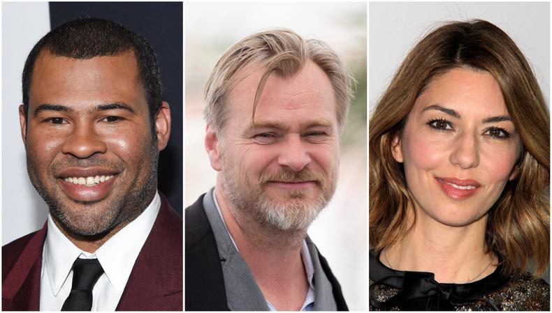
- Christopher Nolan: “Tenet,” “The Dark Knight,” “Inception”
- Jordan Peele: “Get Out,” “Us,” “Nope”
- Martin Scorsese: “The Irishman,” “Goodfellas,” “The Departed”
- Steven Spielberg: “Jurassic Park,” “Jaws,” “Raiders of the Lost Ark”
- Quentin Tarantino: “Once Upon a Time…in Hollywood,” “Pulp Fiction,” “Kill Bill”
- Chloé Zhao: “Eternals,” “Nomadland,” “The Rider”
Their films often feel like personal works, since these directors have clear points of view and cinematographic styles.
For example, in “Get Out,” “Us,” and “Nope,” Peele takes a radical socially conscious approach to horror that illuminates issues of class, race, and intergenerational trauma. Similarly, a distinctive blue color palette, investigation of identity, and romanticization of the West appears in Zhao’s “Songs My Brothers Taught Me,” “The Rider,” and “Nomadland.” Viewers can anticipate the kinds of shots, scores, characters, and stakes any given film by these directors might portray.
Historically, auteur theory has not applied to television, since TV directors usually abide by how writers craft the story. This has changed in recent years with the proliferation of streaming services that sign ongoing contracts with TV directors. For instance, Ryan Murphy highlights marginalized characters and addresses issues of gender and sexuality in the shows he directs, making them highly recognizable—although it is worth noting that he wrote or co-wrote many of these shows as well.
Auteur theory’s focus on the director has led some to contend that it denies the importance of the screenwriter. Others follow in literary theorist Roland Barthes’ steps to say that authorial and directorial intent should not affect analysis and that the text should stand alone.
Director vs. screenwriter
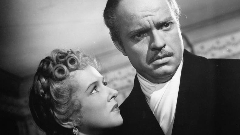
Some critics argue that auteur theory adulates the director while ignoring the screenwriter. In a series of essays on “Citizen Kane,” film critic Pauline Kael claims that oft-called auteur Orson Welles should not be lauded for directing the film. Instead, she says, more credit should be given to screenplay writer Herman J. Mankiewicz.
Film theorist David Kipen agrees that the screenwriter should be thought of as a movie’s principal author. “A filmgoer seeking out pictures written by, say, Eric Roth or Charlie Kaufman won’t always see a masterpiece, but he’ll see fewer clunkers than he would following even a brilliant director like John Boorman, or an intelligent actor like Jeff Goldblum,” he writes of why the screenwriter has utmost influence on a film. “It’s all a matter of betting on the fastest horse, instead of the most highly touted or the prettiest.”
Death of the auteur:
Alternatively, film critics who take a deconstructionist or textual approach find issue in auteur theory’s focus on any kind of authorial intent. Instead, they believe that meaning should be excavated from the film itself, or in viewer response to the film.
Despite these issues, auteur theory is still a popular approach to film analysis. Directorial influence and artistry continue to fascinate viewers and critics alike.
Key sound definitions for the audio unit: 19.02.24

1. Foley is a unique sound effect technique that involves creating and “performing” everyday sounds for movies and television shows. Foley artists create these sounds in a recording studio during post-production, in synchrony with the picture, to enhance the quality of the audio.


3. Non-diegetic sound – sounds from outside the film world, that characters within the film world would not be able to hear.


This is the nearest shelter in my area that i can visit, but its only for Barnet, which is fine for what im trying to do but in general it should be for anyone in any area to come to , this clearly is an example of the shortage and lack of space in shelters that most face in Barnet and London in general.
I could make a magazine spread and cover for a food bank, advertising helping the community and being kind and helping others who need extra support or have low income. I could solely focus on charities and food banks and how they help the communities. The magazine cover will be A4 and the magazine name will be short but effective. I will make a tagline that explains my aims of what i want this community to do and i will have a title that is relevant to my topic but something simple that doesn't explain everything im trying to convey, that will go into my tagline. Another charity for the community that i am familiar with is the charity called GIFT. Its a community engaged, supported and empowered by the gift of giving. GIFT’s mission is to inspire and enable lifelong giving.


- Research business ideas
- Make sure there’s demand for the products you want to sell
- Determine how you'll sell and ship products to customers
- Find suppliers and manufacturers
- Choose which online channels you'll sell through (e.g., an Amazon store)
- Create a website or online storefront and upload products
- Create a plan for your fulfillment strategy
- Begin attracting customers with promotions

- Is growing rapidly
- Offers global marketing reach
- Provides the ease of ordering products online
- Generally involves lower operating costs
- Gives direct-to-consumer access
- All of these points offer strong incentives to participate in ecommerce.


Designing a magazine double paged spread analysis:


Picking my area of investigation and planning new ideas and planning for a magazine cover:08.11.23

Ideas of a name for my magazine that i am going to make:

- Community magazine cover name ideas:
- kindness association
- Handy helpers
- colony of togetherness
- Slogan idea: Our policy is 100 percent generosity!
- Firgun (פירגון) – Firgun is a Hebrew term and concept in Israeli culture used to describe genuine and sincere happiness for another person without any ulterior motives. is often means a feeling of pure joy on seeing someone else’s accomplishment.
- We are one
- Compassion for strangers
- Tagline idea: The kindness you put out into the world always has a way of coming back to you
- Gifting kindness
- (פירגון) society Firgun
- goodwill association
- prevailing foundation
- Gifting provision
- charming suaveness
- Provision as one
I am going to be honest, i was about to pick photography as my topic but, after watching a Dharman video on YouTube called' Rich Women Goes Homeless for 24 hours' , it really inspired me to switch to the community because i think doing my topic based on charity and giving is important and interesting to research and i wanted to learn more about this sector in community as i never had time before to look into it in depth but this project is a perfect opportunity for me to look into this sector of community. I have always loved watching Dharman videos and i still do and watch everyone he puts out daily because they inspire me and teach me most of the time important messages on how to treat others and good morals that anyone can follow. He is best known for his video production company, Dhar Mann Studios, which creates short films for social media platforms such as YouTube. The films target a young audience and typically feature a turn of events that teaches the antagonist a moral lesson. I want to my area of investigation on something that interests me, and while photography is a huge part of my life, i decided to change things up and do my chosen topic on another interest i have to show variety in my work. Anyway, i will have many more opportunities to showcase my passion for photography in other projects and even this one but not as the main focus, which is also ok and im happy with nmy final decision of doing my chosen topic on community, specializing in Volunteer community and a little bit of Religious community of my religion interpreted into this project but mostly just charity and volunteering to help people in need give back to the community. GIFT is a great example of where i would like to research my topic on and get my original imagery photos from. Through the generosity of supporters, GIFT can meet the challenges of nurturing and supporting the community. I am familiar with this organization and i haven't volunteered there before but i have connections to the charity through my old secondary school, my parents and friends. GIFT personally has helped me and my family in the past and are really important to have for helping out the community i am proud to be apart of.
I am going to experiment with my magazine cover main image and get some inspiration and ideas from the local GIFT volunteering center every local to me in Hendon and take photos there for my main photographic image on the cover of the magazine that i am going to make. My main article will be about the importance of volunteering and helping help the community you care about and doing your part. I need to pick an image that will suit the idea that i want. I need to take the pictures first before i start making my magazine cover and putting the ideas into action and doing my sketches so i know exactly what kind of picture i want to use, whether its inside the building showing the volunteering process or the outside of the building or how everything works.
(GIFT is a volunteer organization(Jewish Volunteering Network), whose purpose is to encourage, educate and promote a culture of giving and volunteering among young Jews in the community and at the same time help those in need.)
Instead of focusing on several charities and food banks in the community, i have decided to narrow down the community to my personal community because i connect with it more and is easier to concentrate on one organization, rather than more than one that can become alot to make a website, magazine and magazine spread on.


Tagline ideas for my magazine spread: ( a few of them are inspired from Dharman videos)
“Always be good to everyone you meet, blessings sometimes show up in unrecognizable disguises.”
The kindness you put out into the world always has a way of coming back to you
(Slogan idea: Our policy is 100 percent generosity!)
“Never underestimate the power of kindness.”
“Be the kind of person who makes everyone feel like a somebody.”
Helping others is not only good for them, it also makes you happier
“Be the change you wish to see in the world.”-one of my favourite and its short ,effective and catchy.
“The best way to predict the future is to create it and giving a helping hand"
I highlighted my favourite taglines in yellow.
How to make a magazine and magazine covers examples that help to inspire me in my final magazine design:
https://glorify.com/learn/how-to-make-a-magazine
https://www.canva.com/learn/magazine-cover-design/


Experimenting with different typefaces on illustrator:


This is what i have done so far for experimenting with my typefaces and styles. I have started off concentrating on designing my main title for my magazine cover first then i will experiment with creating the taglines typefaces and character Styles on adobe illustrator. I haven't added any color yet to my main magazine cover title but i have added a shadowed mirrored effect with a bold typeface and i did that all on Adobe Illustrator.

Above these are some typefaces styles on google i thought looked interesting and i could possibly use in my magazine title styles.

 |
| My primary research questions that i asked |


 |
| My primary research questions that i asked |
 |
| My primary research questions that i asked |


This Jewish reddit page post so far has 1.6k views and no replies but at least it got unremoved and approved, so hopefully their will be some feedback soon. Update: Someone gave me some amazing and useful feedback on the Jewish reddit page answering all my questions . I only got 1 detailed response from the Jewish reddit page and i got no responses on the regular reddit page i made, but I'm happy as i got lots of feedback on the digital spy forum that i made and this was just meant to be a backup option of feedback just in case the forum didn't work out, but it did and i got lots of useful feedback i can use in my final design for my magazine and website design.


From the photos i have taken, i will decide which one is most suitable for my target audience and then from there draw a sketch of how i want my magazine cover to look and then create it. I will do something similar for my magazine spread design but with more research and text added on to it.
I didn't take these photos there from google, but i want photos taken by myself similar to these for my main image on my magazine cover or a sub image in my double spread sheet design. The photos i would take would have many people working as a community in one image, representing the gift of giving and how the Jewish community can work together to volunteer and builds a community of Firgun, giving and generosity. I also want to take pictures of food parcels supplies in a volunteering warehouse, spread out in a visually appealing way. The organisation GIFT has really inspired me in my theme and overall design, but i will add my own creative and original touch to the overall outcome of my magazine cover and spread.


Primary research 1 of 2- planning original photography-experimental photos: (1 is feedback and 2 is original images taken by me):21.11.23
location of where I'm am taking my photos:(At the GIFT: give it forward packing warehouse full of volunteers of all ages) Address- 61 - 63 Watford Way, London, NW4 3AX. GIFT inspires the next generation to become givers through dynamic education, impactful volunteering and helping those in need.
https://www.yell.com/biz/gift-give-it-forward-today-london-8499554/


Below are the images i have taken myself on my camera for my magazine cover's main image(i will pick one out of all of the photos for the cover main image) and maybe some magazine spread sub-images, that i could possibly also use in my website that i am going to create soon and these are also pictures that i will use on my website, not all of them but a few i choose to use will be key assets to my websites overall look on all 3 pages i am going to create.


Opening scene : week 1 Open scene analysis(1 genre 3 ,movies):09.11.23


opening scene 1: Ruby Gillman, Teenage Kraken: genre =Adventure/Comedy: DreamWorks animation studios (2023)-director Kirk DeMicco:


https://youtu.be/eOT_IsZgzXU?si=pgLGfhHvZt-PEpmN
ruby Gillman's personality props location , what does it show us. both unwater mythical animated creatures in both movies i picked.
Ruby Gillman is the titular leading female protagonist of the DreamWorks animated film, Ruby Gillman, Teenage Kraken. She is a sweet, awkward 16-year-old kraken teenager who is a direct descendant of her species’ royal lineage, and destined to inherit the throne from her grandmother. She starts out as a insecure teenage girl, then grows over the course of the film to a confident hero. When exposed to ocean water, Ruby transforms into a giant kraken. In this form, her skin changes to purple, having a slight sparkling texture present throughout most of her body.
In the opening scene of RUBY GILLMAN, TEENAGE KRAKEN , we are immediately introduced to our main protagonist ruby Gillman talking to the audience in 3rd person and then shortly after the main agonists on ruby's journey which are her family, (mum dad and younger brother). They are trying to live a normal life and lives in the seaside town of Oceanside. Just like the rest of her family, she lives her life pretending to be a human. , but struggles at times since her and her family are a family of krakens, disguised as a human family, so no one discovers their secret of being sea creatures.
In the opening scene, you get already get an impression of Ruby Gillman's personality, which is a shy teenager whos sweet and awkward and is desperate to fit in at Oceanside High, but she mostly just feels invisible and has a reserved nature resulted in a lack of self-confidence. She is curious about who she is and wants to know her true self above and below water.
Her interest in the ocean is an interesting one, and something that is seen all throughout the film. Even though she had never entered it, the ocean had always endeared her, appearing to be well-drawn to it. Her bedroom is filled with ocean-related knickknacks, and she reads a quarterly-released magazine called The Marine Biologist Quarterly, even if her mother expressed her objections. Despite this fixation, she was deathly afraid of the ocean, never wanting to be confronted by it in a situation, which stemmed from her mom’s anti-ocean rule.
At the very start of the opening scene, we are instantly introduced to Ruby Gillman in a wide range shot of her bedroom and the setting looks ocean themed from the the sea shell pillows and blanket she has to the boat like featured windows in her room. These props are a huge giveaway to her connection to the underwater world, or at least her love for the ocean. We then get a shot of an extreme close up of her feet, showing the viewers that she is not an ordinary teenage girl and could be an other worldly sort of being, trying to act like a human girl to fit in with the world above water. At the end of her prom presentation in the opening scene, to her mum Ruby wore her normal outfit to fit in as a human with black sunglasses to hide her kraken features, such as her gills for ears and large blue hands.


This is an image of an extreme wide range shot of the setting of the town that Ruby Gillman and her family live in.
opening scene 2: Inside Out: genre=Kids & family, Comedy, Fantasy: Pixar Animation Studios :(2015)-director Pete Docter:


Riley's personality props location, what does it show us.


The film Inside Out presents a curious take on how emotions create lifetime connections within one's brain that constitute and influence their personality. Much of the film takes place in the head of an 11-year-old girl named Riley, with five emotions: Joy, Sadness, Anger, Fear, and Disgust, embodied by characters who help Riley navigate her world. The film has some deep things to say about the nature of our emotions.
When Riley was first born, Joy was the first ever emotion to be born. She then walked towards the control panel, which at the time consisted of only one button. The instant she pressed it, infant Riley began smiling. However, 33 seconds later, Riley began crying. Joy soon realizes that Sadness (the second emotion to come to Riley's mind) has arrived and has pressed the button. When Joy looks at her, Sadness introduces herself, and Joy awkwardly moves her aside to fix the situation.

Reader view:
- rising action
- The series of crisis/conflict Leading up to the climax
- Falling Action
- ex. from inside out
- All of the action that follows the climax
- climax
- ex. from inside out
- Turning point in the story
- ex. from inside out
- Riley moves from Wisconsin to San Francisco
- The house is not as she had imagined and the moving truck will not get to her home for a couple of days
- Her emotions in Headquarters start to disagree on how to deal with this dramatic change
- Joy and Sadness get sucked up the tube into Riley's long term memory along with the core memories
- Riley's life is falling apart because joy is not at the control panel to allow her to have happiness
- Riley gets angry at her parents and runs away
- After taking control of her emotions, Riley gets off the bus before it leaves and goes home to admit to her parents she misses her old life
- exposition
- Beginning of the story
- Introducing the main characters
- ex. from inside out
- Introduces the main character, Riley and her emotions
- Gives background of her past
- Introduces her core memories
- resolution
- The conclusion
- ex. from inside out
- New core memories are created with multiple emotions
- The control panel gets an upgrade with a new button for puberty
- What is a plot?
- setting
- Where a story takes place
- ex. from inside out
- The setting of the movie takes place inside of Riley's mind
- Plot & Setting
opening scene 3: Luca= Family/Adventure: Walt Disney Pictures and Pixar Animation Studios :(2021)- director Enrico Casarosa:


Luca's personality props location , what does it show us. both unwater mythical animated creatures in both movies i picked.
In the movie's opening scene, two fishermen take their boat out to sea at night. As they make their way through the water, they begin talking about sea monsters, debating whether or not they exist. As they talk, a sea monster becomes visible, lurking through the water and snatching some of their belongings from the boat, terrifying the fishermen.
Protagonist Luca Paguro is a bright and inventive 13-year-old sea monster with endless curiosity – especially when it comes to the mysterious world above the sea. Although he's been warned his whole life that the human world is a dangerous place, he longs for something beyond his quiet farm life where he herds goatfish day after day. So when another sea monster with actual experience above the surface takes Luca under his fin, his eyes open up to a whole world of possibilities.
The scene succinctly introduces the dynamic between sea monsters and humans, setting up the central conflict for the rest of the film. The humans are not sure if the sea monsters exist, but if they do, then the humans are afraid and want to kill them. Luca starts out as a very timid and shy but curious and imaginative character. He is afraid of the surface, but is also very curious about it.

When Luca's parents discover that he has been sneaking away to the surface with Alberto, they decide to send Luca down to the deeper part of the ocean to live with his Uncle Ugo, which prompts Luca to run away from home.
Uncle Ugo rambles on about whale carcasses, losing consciousness at one point because of the changes in oxygen levels, and he needs Luca to punch him in his translucent chest in order to restart his heart. This interaction is arguably the funniest scene in the movie, thanks to the hilarious vocal performance of Sacha Baron Cohen as Uncle Ugo.

After finding out that Luca's parents intend to send him to live with Uncle Ugo in the deeper part of the ocean, Alberto convinces Luca to run away with him to the human town of Portorosso in search of a Vespa that the two can use to explore the world.
As they travel towards Portorosso, they jump off a cliff into the water and gleefully swim and jump, coming in and out of human form. It is a beautifully animated, joyful sequence that perfectly captures the excitement and optimism Luca feels in that moment.

Luca comes across the record player from before. As he approaches it, a figure in a diving suit goes near Luca. Thinking it’s a human, he hides in a cave. The figure pulls off their helmet to reveal the other sea monster from earlier, a boy around Luca’s age named Alberto Scorfano (Jack Dylan Grazer). Luca watches as Alberto goes up to the surface and changes into a human boy, and when Luca is pulled up out of the water, he does the same, due to his curious personality of life beyond the water, on the surface.
Alberto has a scar on his upper left arm. He actually got it when the fisherman in the opening scene threw a harpoon at him as he escaped.
Two Italian fisherman are at sea. They talk about the possibility of sea monsters seen around a nearby island. The younger fisherman fears they are real. They listen to a gramophone playing Puccini as they head towards the good but potentially dangerous fishing spot.
A purple scale covered arm reaches out of the ocean to steal things from the fishing boat. It is seen by one of the men and both fisherman and sea monster panic. The sea monster (revealed later as Alberto) gets caught in the fishing net. As the fisherman struggle to reel him in, the boat rocks and the gramophone falls into the ocean. Alberto escapes as they throw harpoons at him. They turn the boat back home before the monster comes back.
He daydreams about seeing above the water and the surface world beyond. Luca’s mother calls him for lunch. He hides his found treasures and takes his herd home. Luca is out in the pastures again and finds more human objects. He spots the gramophone from the fishing boat and approaches it. A figure in an old diving suit comes from behind and frightens him. Removing his helmet, Luca the protagonist meets Alberto the other main character antagonist of the film, with an powerful storyline and he's the main antagonist to Luca in the duration the the film and he is 14, and is also the sea monster from earlier. They are other main characters as the film goes along but for now in the opening scene, its just Luca, Alberto and Lucas family.
Opening scene week 2: exposition analysis:16.11.23

Write about how they show the hidden meaning behind things(exposing the details), eg how the movie exposes the hidden messages through what the outfits were ect,. conflict and character conflicts. (The exposition is the beginning of the movie where the main characters of the movie are introduced and the viewer finds out something about the characters. The complication is the conflict that the protagonist must face, struggle with, and resolve by the end of the movie. It is the writer's way of giving background information to the audience about the characters and setting of the story.)
Exposition can be dialogue, narration, or even visual information the audience receives that helps them better understand what is going on in the story.
WHAT CAN EXPOSITION DO?
- Reveal more about character
- Describe the story world
- Reveal theme


The main messages from Ruby Gillman, Teenage Kraken are about finding yourself and negotiating the challenging teenage years. Overall the film is a typical movie-going experience, with some action, entertaining visuals and story, and an upbeat soundtrack. This film teaches a good lesson about putting the greater common good above your own personal fulfillments.
No matter how you choose to deliver your exposition, always keep the audience’s patience in mind. This film has a young audience of all ages, so the opening scene must be short and visually appealing and not put the audience to sleep because of too much dialogue, but this film has a good balance of great visuals with lots of impact, and a small dramatic monologue to the audience not yet introducing any faces but talking about an important overall message that will linger through your mind during the duration of the film of "The ocean is a mysterious world" . So we as an audience immediately know that the ocean has a big part of the overall arching theme and deeper meaning of the film. Even before meeting the main character, we know that the film will be all about good vs evil, Kraken vs mermaid and ocean vs land life.
The tone of the scene drastically changes from "The ocean is a mysterious world" to "Take the mythical mighty giant Kraken" , which coveys feelings of tension that will later occur and is a main theme of the film. There is a huge stereotype in this movie that we immediately find out that people on land think of krakens of "blood thirty monsters, sinker of ships, downer of sailers", esentiallly something to be feared and stay away from, but this movie breaks this stereotype and has the main protagonist a female kraken who is the opposite of what they describe crackens to be in the beginning of the film. The twist is that mermaids are the antagonists and villains of the film and are they are the greedy monsters who only want power and the ending scene is a perfect example of the deeper meaning of the film, when the krakens women save the humans and the mermaid caused all the ruckus to start with and only had malicious intensions, which the krakens never showed characteristics of. The family was hiding as humans to blend in throughout the film as they were scared that the humans would fear them in their true form and hunt them and be killed. Since this is only an animation for kids, they wouldn't have a killer in the film, so instead their is a paranoid minor antagonist called captain lighthouse spreading false fears and implementing lies into people's heads that krakens are the most evil creatures in the sea and must be feared. Ruby is not concerned about being found out as a Kraken specifically. She's worried about being found out is a non-human.
The title of this film pretty much sums up this movie's story – Ruby Gillman is a teenage kraken. Her journey of self-discovery and crisis of identity is a fishy metaphor for the turbulent transformations of her teenage years. Ruby Gillman, Teenage Kraken has appealing animation and worthwhile messages about embracing difference, but it feels a little derivative.
The occupation of this film is about Ruby Gillman, a sweet and awkward high school student who discovers she's a direct descendant of the warrior Kraken queens. The Kraken are sworn to protect the oceans of the world against the vain, power-hungry mermaids. The mermaid is the villainous protagonist and the Kraken is the antagonists throughout the film. A villainous protagonist, or protagonist villain is a character who is the central focus of a story(Chelsea the mermaid) but isn't the hero of its story(Ruby Gillman ).
The intense action in this film's opening scene constructed by the writer is the idea that has happened on many animated cartoons and movies that Ruby Gillman is thrust into a role of an action hero but all the scenes that take place underwater are quite beautifully animated, especially the ones where Ruby is swimming through the ocean embracing her Kraken heritage. The intense use of a strict mother in every teenage story, is frustrating in a narrative sense, but the writers in this film break away from that intense action of a typical strict mother and Rubys' mother is supportive and loving throughout to her during the movie, even in her mega kraken form and everything her mum does she does it for good reasons. The movie shows every right to do what she did and she was just looking out for her family the whole time. Its refreshing and nice to see that the writers of this movie break away from typical character stereotypes and everything that happens in terms of events in this movie make sense and happens for a reason. The story is well unified and the opening scene is slow but it discovers the deeper meaning of Ruby and her relationships. The movie uses good troupes, instead of bad ones and its a teen drama so it couldn't have been like any other one, but its not its different and i get the impression that the movie just wants to tell the story the way it wants.
Ruby Gillman is a really likable protagonist and has a gripping personality that you want to keep watching on screen, she is lovable and relatable and genuine , especially when in the opening scene where she took her nighttime retainer out her mouth , like most teenagers to after braces. The voice actor for Ruby Gillman sells her character well and i love how she insentiques her insecurities and makes her vulnerable, which makes the character relatable agian, and sympathetic. The movie is primarily an emotional journey for her charcter and she is more vulnerable than most Dreamworks protagonists.


We tend to categorize our emotions: joy is good, sadness is bad, anger is bad. We are typically taught that it’s important to put on a brave face, to respond to, “How are you?” in positive or neutral way, and that the “good” emotions are the most important. In reality, emotions are not good or bad—they just are what they are. It’s the way we project our feelings out into the world that can lead to negative or positive interactions. For example, it’s not okay to angrily lash out at someone who calls out a truth that makes you feel uncomfortable or upset. However, anger is productive in the face of injustice because it incites action and causes disenfranchised people to fight for what’s right. It can give you positive drive and motivation. We have to learn to respect all of our emotional centers, acknowledge when we are feeling something, sit with that feeling, and make a wise choice about how we engage with that emotion.
Like Riley, we all have a center of core memories. They are the pivotal and important moments in our lives that have shaped us into the person we are today. As we get older, those memories may be attached to a mix of emotions. Or we may look back on them through a rose-colored, nostalgic lens. Either way, it’s important to tap into those core memories because, as the film says, they are what make you.
opening scene 3: Luca= Family/Adventure: Walt Disney Pictures and Pixar Animation Studios :(2021)- director Enrico Casarosa:


This Pixar film balances a comedic and dramatic tone that audiences of all ages can enjoy. The movie contains outstanding animation, likable characters, and a magical story, which are all o be expected from the studio at this point. These elements come together to create memorable scenes that are sure to resonate with audiences and possibly become iconic over time.
The underlying message behind the film is the common societal fear of struggling to fit in and discovering oneself. The portrayal of Portorosso as an unsafe place for sea creatures represents an overarching issue in the real world.
There’s a lovely theme about wanting to be a part of something outside of our immediate families ,wanting to experience cultures beyond our own. Luca discovers the power of exploring and celebrating another culture, while learning to honor and share his own. Also, a hidden message inside the beauty and culture of the movie is a very powerful message of friendship and acceptance ,of yourself as well as others. Sea monsters are a metaphor, really, for feeling different or excluded and all the characters in some way feel different or unusual. Luca and Alberto so passionately want to be part of this other world, but they fear they won’t be accepted as they are. Yet, they still love being sea monsters.


In the beginning, the storytellers set the scene and the stage. In Luca, we are in a small fishing village in Italy. We learn about the underwater world of sea monsters through the eyes of Luca, one of the main characters.
The rising action in Luca is not necessarily a linear progression, but it is constantly increasing the tension. For example, there is a scene where Luca and Alberto's human friends discover that Alberto is a sea monster, and Luca denounces him. This story structure is great for keeping you engaged throughout the movie as you connect emotionally with the winding journey of the characters.
Opening Scene: Idea Generation homework-09.11.23


My magazine cover sketch is drawn in pencil with no color added:
 |
| Initial drawing of the design and layout of my magazine cover that i am not using because its too cluttered, i will do this but with 1 main image and in a clear and arranged way. |
 |
| This is just a brief drawing of how i can layout my cover page and the title, large in bold, sideways, or in the middle of the magazine cover. |
Next lesson i will start attempting to create my sketch on Adobe Illustrator and see how that goes. I want to concentrate on making my magazine cover first then, i will move on to making my double magazine spread, then write my article for my magazine spread. I am planning on taking pictures on my camera before then end of November at my local GIFT charity organization of them volunteering or something along those lines to show the message of the theme i have chosen within the Jewish community. I have asked permission and i am waiting for them to come back to me about whether i can take pictures of the building and the volunteers or not, but my dad has connections and i think it won't be a problem taking the photos as soon as possible. The pictures don't necessarily need to be of GIFT, that was my initial idea of where to take my original photos. My backup plan is to get my parents and my sister to pretend like they are packaging food or gifting and volunteering showing kindness with a community-like feel of a genuine pleasure to help those in need and build a strong Jewish community for future generations to come.
15.11.23-I have gotten some feedback and i have decided to draw another brief sketch of my cover and remake it I'm not going to go with the layout of my original sketch as its to cluttered together and busy and the magazine cover should only have one main center of attraction image, not 3. I want my magazine cover and spread to not look cheap like gossip magazines for news, i want it to look sophisticated, eye-catching, and clear to the audience what my message i want to put across is through my main center image and cover in general with the graphic elements and typeface being clear and bold and for my cover not be a mess of ideas put all into one cover, it has to be well organized and clear, like how David king made his magazine cover layouts, having a good slogan, main image, and elements that will apppeal to my audience and keep them reading my magazine spread and liking the way my cover looks as well, because if my cover looks bad then the audience will looose interest in my magazine spread as well and they will be dissatisfied and unimpressed, which is what i want to avoid doing when i create my magazine cover and spread designs.
My magazine cover will be a mix of graphic and photographic. The hand-drawn reaching down grabbing the image near the main photo is a graphic element on my cover representing the volunteering and lending a hand to help the Jewish community and be included and to show kindness. I might end up removing the graphically created hand on my cover as it might distract the audience on what the message of my cover is and they might get confused. Instead, i might take my main image with someone with the arm and hand stretched out holding a packing parcel and make that my main image, but i will take many versions(mainly in colour and possibly some in black and white lighting) of what i think the main image should look like, then experiment and see which one best fits my audience and message im trying to put across in my magazine cover.

This is not exactly how i want my cover to look like, its just a plan for now.

Page 1 will be my magazine cover and pages 2 and 3 will be for my spread together in one layout. I will be using InDesign to make both my cover and double spread, but use Abode Illustrator and Photoshop a bit for a few elements in my cover( then putting that into my main indesign magazine cover), not spread, but i will mainly focus on doing it all in Indesign and get better at using it and learning and practicing getting better at it in the process.

Some creative magazine designers( researching inspiring magazine and layout designers): 15.11.23
This is to inspire me in my own design and help me with my evaluation later on.


David King (1943–2016) :

The designer, collector and author David King was a unique figure with a body of work that spanned graphic design, journalism, photography and visual history. He was an artist, designer and photographer who built up a massive archive of Soviet-era artifacts. David King had one of the most remarkable graphic design careers of the 20th century. If his name is unfamiliar, it’s not for lack of success, but rather that his accomplishments were incredibly varied and took him away from the mainstream design industry—first towards political activism, then finally to visual histories. He was best known early on for his editorial designs at the influential Sunday Times Magazine and covers for Penguin books, and his political posters defined the graphic aesthetic of the British left in the ’70s and ’80s. Besides his influential collection, King used his skills as a designer to further causes he vehemently believed in, especially the fight against racism, fascism, and human rights violations. He was a visual historian, artist, journalist, and activist.
He was best known early on for his editorial designs at the influential Sunday Times Magazine and covers for Penguin books, and his political posters defined the graphic aesthetic of the British left in the ’70s and ’80s. Besides his influential collection, King used his skills as a designer to further causes he vehemently believed in, especially the fight against racism, fascism, and human rights violations.
King launched his career at Britain’s Sunday Times Magazine in the 1960s, starting as a designer and later branching out into image-led journalism. He developed a particular interest in revolutionary Russia and began amassing a collection of graphic art and photographs—ultimately accumulating around 250,000 images that he shared with news outlets. Throughout his life, King blended political activism with his graphic design work, creating anti-Apartheid and anti-Nazi posters, covers for books on Communist history, album artwork for The Who and Jimi Hendrix, catalogs on Russian art and society for the Museum of Modern Art in Oxford, and typographic covers for the left-wing magazine City Limits.
By the time of King’s death in 2016, Tate had acquired his entire collection, easily one of the largest in the world, which encompassed an estimated 250,000 items, including photographs, posters, publications, and ephemera. Amassing such a significant archive of visual material would be an impressive life’s achievement on its own, but King managed to do this alongside an award-winning and politically era-defining career as a graphic designer.
King worked for The Sunday Times Magazine for ten years in all, five of which were in a freelance capacity that gave him more freedom. His graphic influences there included Pop Art. King often used brightly colored and multi-layered silkscreen prints for his illustrations, as well as half-tone color effects. Constructivism, and avant-garde photomontage. However, it was his ability to lay out photographs creating a compelling visual narrative, as well as his eye for cropping, that ultimately lead to his success at the magazine, a serial D&AD Award winner during Rand’s tenure.
Many features of King’s later work—as well as his interest in racial equality—can be seen in this particular freelance project, such as imposing bold typography and heavy dividing lines. It caught the eye of Michael Rand, art director of The Sunday Times Magazine, who offered King a job as a designer in 1965. Two years later, he was promoted to become art editor. The magazine was the first color supplement to be published by a British newspaper and had a well-earned reputation for the quality of its writing and imagery, with features free from the disruptive presence of advertising, which was kept separate.
Born in Isleworth in 1943, King “despised capitalism” even as a child, as he wrote in one of the many books he authored. He went on to study graphic design at the London School of Printing and Graphic Arts, where his teachers included Richard Hollis and Robin Fior, two of London’s most politically involved designers, as well as Rolf Brandt, brother of the famous German photographer Bill Brandt. It was with Fior, a member of the anti-nuclear Committee of 100, that King first worked using the paste-up method (cutting and sticking by hand) on layouts for the pacifist newspaper Peace News in 1962. Throughout his career he maintained a very tactile approach to design, never switching to the computer. Editorial design and political activism would be the two key defining aspects of the rest of his career. It was also Fior who introduced King to the work of German designer and political satirist John Heartfield, whose montage style would be a key visual influence for King.
After finishing his studies, King went to work as art assistant at Queen magazine, one of swinging London’s most fashionable publications, under the direction of the influential Tom Wolsey. King’s time at Queen was short-lived, he left with Wolsey to form the advertising agency Stratton & Wolsey, but while working at the magazine he made two important connections. One was with the photographer Don McCullin and the other with illustrator Roger Law, with whom in 1965 King designed the first issue of Magnet News, a newspaper aimed at a Black British audience.
Interesting interview David King did talking about his design and photography inspirations:
CW: You worked on The Sunday Times Magazine from 1965-75, and during that period it seems to have been very design-led. Did you push that approach when you were there?
DK: Many magazines were notoriously non-visual in the mid-1960s, although they were supposedly visual publications. The Sunday Times Magazine wasn’t like that. The art director, Michael Rand, was brilliant, and while the editors didn’t necessarily understand the art department, they were very favorable towards it. It was a colour magazine, but there wasn’t a lot of colour material around – we used to have black and white photographs printed in four-colour black, or we’d hand-colour them, or make silkscreen prints of them – every technique you could think of. It was very much influenced by Pop Art. There was one boxing feature where I made a thirteen-colour silkscreen, which was then printed four-colour halftone.
CW: Is that what lead to you photographing for the magazine?
DK: After two or three years of designing pages, I got bored and wanted to expand. Donald McCullin gave me a four-hour lecture on how to take pictures, and came down to the camera shop with me to buy a Nikon F2 and a couple of lenses. That was important, because if I was going to make visual features, then of course it was advisable to take pictures as well.
Cover and spread layout examples of David kings work:
Graphic magazine cover:


He rarely favoured full-colour half tones, but would use three or four flat colours for a brilliant effect. Ink colours were most often black and red, and images were often overprinted in both colours, which made them a reddish sepia. King’s style suited David Elliott, director of the Museum of Modern Art Oxford (now Modern Art Oxford), who commissioned him to create catalogues and posters for the Soviet art exhibitions Alexander Rodchenko (1979), Vladimir Mayakovsky: Twenty Years of Work (1982) and Art Into Production: Soviet Textiles, Fashion and Ceramics 1917-1935 (1985). His work is celebrated in a current exhibition at the gallery, David King: Designs for Oxford (1979-1985).
I love how this cover has an interesting to-the-eye overlap of image to typeface and its definitely an old-fashioned surreal cover that could have brighter colours bit for the time it was made, it really effective and has good use of minimalistic colours . This is all graphicly made and i chose this cover to put on my blog not because i want my cover to look like this, (i want mine to be more modern and entertaining to my demographic i am trying to show my magazine cover and spread towards.)but to show the element of overlapping an image or graphic drawing on top of text can still be clear and effective, and i can try and possibly do that in my cover to keep it look visually appealing and different to my target audience. It can visually describe the message of my topic eaiser and more effectively with text and an image together but not overpowering each other, just making it even better and visually looking like a higher standard of a magazine cover, in its own critical and unique way.


A little-seen David King project: spreads from My Life in Pictures, a pictorial autobiography by Charlie Chaplin, published by The Bodley Head in 1974. It was one of King’s earliest book design projects, but the techniques of impactful picture editing, narrative construction, acute visual pacing and expressive montage that distinguished his later books as author are already in place.

Photomontage by David King for the feature "No Medals for Mao" in The Sunday Times Magazine, 27 August 1972. The Munich Olympics had opened the previous day and The People's Republic of China was, once again, not a participant.


I found this magazine at boots for free and i really liked the layout of the cover of the magazine and i have been inspired to use some of the features of the cover in my cover to make the design visually more appealing.

' 'Donating to FIRGUN is a way of expressing our thanks for how it has inspired our children to want to make a difference in the world…'- make that my quote on my magazine spread.- Update, I never ended up using that as my quote for my magazine spread.


The barcode is definitely in the right place now (I got the barcode from google and copy and pasted it into my cover), but im not sure about removing the background, yes it looks neater, but i made that choice because i thought it would make the cover look more professional and realistic and make you only concentrate on what the people in the picture are holding not the background, which could be distracting and take away from the main message of the magazine cover, but now its a bit too plain so im not sure what i can do to make it look better other than making the image with the background removed bigger to fill in empty spaces on the magazine cover. To get people excited about reading it, i could maybe put something interesting like " find out more about this *spectacular volunteering project/charity fundraising effort* on page 5 somewhere on the cover and the spectacular project could be whatever the photo is trying to portray as the main message of the magazine, which is generosity and gift giving forward and to inspire and enable lifelong giving. I thought that the background colour was boring and basic, so i made the background into a purple gradient to make the cover look more interesting and pop out more, making the audience more tempted to give my magazine a chance if the cover of the magazine looks well structured and not messy and has nice colours and type on it.


My final magazine cover:

Must include some technical information about how it was created and also how you created any original imagery. Include your opinion of your work.
Creating my magazine spread progress: 22.11.23:


My final magazine spread:

For my magazine spread article, i used google for a few of them but i also made a few sub articles of my own not from google. The Pull-quote i added on my spread is important and should and is quoted by a real known person in the Jewish community who is no longer alive called Rabbi Shimon. Having a reliable pull-quote help sell the story and message of my magazine as a whole and it adds drama and more of an attraction to the spread article and page. I added page numbers to match up to my magazine spread and contexts page and obviously i didn't add a page number on the cover because its clearly the first page , but on pages like my spread its important to have page numbers for easy navigation when readers read your magazine. I exported my magazine cover, spread and contents page as a pdf to send to the teacher. I added a pull quote and lots of my own original images to my spread cover and contexts page and im really happy with them, they really add to the overall effect of everything.
Creating my magazine content spread:22.11.23
Examples of magazine content pages:


My final magazine contents page:


I experimented with lines going across the page giving an eye catching effect and i could have used the box shape modifier tool and put the image into the shape box but i tried my best with what i knew how to do and i think it adds a unique effect to my magazine contents page. Annoyingly, on my contents page i made a subtitle called donating essentials guide, but in my final product, for some reason the words 18 got cut out and its meant to say 'Donating essentials guide 18' on the image but theirs no point adding the 18 on as i already finished everything, so it would be a waste of time to go back and add 18 on that sub title for the image on my contents page. One of my photos i took and cut the background out and added it as a nice feature on the contents page, if i would do it differently, i would make the image with the background cut out of it a bit bigger. I didn't end up adding a graphically drawn hand which i was originally planning todo on the magazine cover somewhere, but i think what i did looks like how i wanted it to turn out and the cover does look a bit like a leaflet, but you can definitely see magazine cover features like barcode and a bold masthead, and i tried my best and considering this was my first time making professional magazine products , using InDesign to create everything went really well.
Opening scene script writing task: first draft:23.11.23

https://deadline.com/wp-content/uploads/2020/01/jojo-rabbit-final-script.pdf
INT. JOJO’S HOUSE - MORNING
We open with QUICK DETAIL SHOTS of a young boy dressing:
- A brown shirt buttoned.
- Badges pinned.
- Belt tightened.
- Neck kerchief tied.
- Socks pulled up.
- Hair combed.
- Shoes clicked together at the heels, one foot stomps down
hard on the floor.
He is dressed. We PULL to a CLOSE-UP, coming face to face
with our HERO...
JOHANNES BETZLER, (JOJO), a cute 10 year-old boy.
The room is covered with NAZI POSTERS and other
PARAPHERNALIA,
including pictures of ADOLF HITLER. You
guessed it, he’s a little Nazi.
Jojo stares into a full-length mirror and takes a deep
breath.
JOJO
Jojo Betzler. Ten years old. And today
you join the ranks of the Jungvolk in a
very special training weekend. It’s going
to be intense. But today you become a
man.
(deep breath, nervous)
I swear to devote all my energies and my
strength to the savior of our country,
Adolf Hitler. I am willing and ready to
give up my life for him, so help me God.
A STRANGE FIGURE passes behind him, an ADULT, dressed in a
NAZI UNIFORM. It feels ghostly and fantastical. We’ll find
out who this guy is very soon.
VOICE (O.S.)
Yeah man, that’s right.
(beat)
Now, Jojo Betzler, what is your mind?
JOJO
A snake mind.
VOICE (O.S.)
And Jojo Betzler, what is your body?
(CONTINUED)


I want to make a script that is as good as this one i found online called jojo-rabbit. This is the first script page and opening scene for jojo -rabbit i took inspiration from, of the layout and structure of the opening scene.
Jojo Rabbit is a 2019 comedy-drama adapted screenplay film written and directed by Taika Waititi, adapted from Christine Leunens's 2008 book Caging Skies.
This script opening scene i wrote is also inspired/based on the current storyline in Neighbours that has caught my interest about Krista Sinclair being a drug addict and victim (and is dealing with the heavy emotional trauma of loosing her dad and not being able to say goodbye to him before he died) but is trying to get better on her own without rehab and faces many withdrawal symptoms. This storyline has inspired me to make a script similar to this but also about my area of investigation topic of community ,generosity and kindness in the Jewish volunteering community of London and i tried to add those aspects into my scripts opening scene as much as i could. That's why i made the main protagonist Amy Jewish to relate to my chosen topic better and about community. Amy is the main protagonist, her mum is the secondary character and her drug addiction and her dad are the main antagonists, in my script. Amy is the victim and hero of her own story.
Script narrative idea (for the script opening scene and also about her story, after the opening scene, thinking beyond for a whole script as an extra thing to set the environment and context better for my opening scene.): Set at Amy's house in the morning, a young 15 year old girl goes volunteering twice a week after school and is suddenly coming home late becoming more and more secretive. Goes out often to volunteer, but frequently breaking curfew and Disappears for long periods of time and when she is home, she locks doors and talks to herself. As time goes on her behaviour gets worse and there is at this point noticeably something wrong with Amy's mental state. There is a loss of other activities interests such as volunteering and her motivation to say happy and give back to the community and do her weekly volunteering and being honest with her parents is a blurred line and is on the verge of becoming non existent due to drug addiction ruing Amy's life. can she put her life back into place by admitting this addiction and take back control of her actions and be the good person she really is deep down not a helpless addict. Volunteering can help you to understand who you are and what you really want to do in your life so maybe Amy might stop derailing her life if she gets the help that she needs and carries on volunteering but with supervision so that she doesn't get tempted to go elsewhere after helping out at the local volunteering centre. But being mentally ok with her dad in the picture is another challenging factor in Amy's life that she must go face to face with in order to help herself get better and stop all the bad habits before it gets uncontrollably worse and irreversible. Having someone in Amy's circumstances for instance like her mum, to support and be there for her at a time where you don't even trust your own actions is crucial to give Amy the help and support she needs and reminding her constantly that she is not alone and things can change with the right choices, recovery is possible and getting her old life back minus her toxic dad, when things get better and healthier for her, but if that doesn't work and the addiction is more severe than her and her mum initially thought, then Amy will have to go to rehab, then get more additional support after, having a sober companion paid to live with her at home and keep track of things at all day ,when her mums not around to monitor her addiction. With this in place, Amy will be back to her normal teenage life in no time, but first Amy's parents must get a divorce and remove all contact with him for the sake of Amy getting better and not disrupting the recovery process.
'What really defines us is the choices that we make moment to moment' is an important quote about the choices you make determine your outcomes and choices abound for you. What makes matters difficult is when you make a series of choices that slow your progress. Choices like deciding not to work hard enough, or thinking that you've done enough work. I this learnt recently from an episode of Neighbours. Amy from my script i made must take to heart and listen and understand the meaning behind these powerful words, otherwise she will never get better. Our identity defines the choices we make. Our actions become our identity. No ones is defined by their lowest moment and we can make the right choices to fix our mistakes not dwell on them and hurt ourselves even more. The question is what does Amy want her next choices to be?
Script name: "choices" by poppy.g -I chose choices as the name of my scrips opening scene because it really does define the overall message of my script that i wrote of Amy making choices to go into a life of drug dealing and choices to get better and recover is a possibility if effort is made and commitment is there. Then Amy can go back to her volunteering responsibilities for the community and make the right choices and not let her dad and drugs defines who she really is deep down, a young girl exposed to trauma that needs help due to bad ways and choices she made of coping with her problems and ran away from them and made it worse rather than better in a way she can cope with these things going on in her messy life so far as a 15 year old Jewish young vulnerable girl.
“Volunteers do not necessarily have the time; they just have the heart.” This is by Elizabeth Andrew, an American author. This volunteer quote is iconic because it encapsulates the concept that the time that volunteers give is valuable and deeply appreciated by your organisation.

INT. AMY’S HOUSE - MORNING
We open with QUICK DETAIL SHOTS of a young girl dressing:
- An ordinary purple shirt and black leggings .
- All her volunteering badges pinned on her cap.
- Belt tightened.
- Handy helpers volunteering cap on.
- Socks pulled up.
- Hair combed into a low bun.
- Casual trainer shoes on loose with laces untied together hard on the floor.
-She holds/clasps her hands together strangely so they dont shake ( drugs cause hand tremors ) Thats her bodies negative reaction to the drugs in her system and recently its been getting stronger and harder to hide from the people around her so she finally, in the end of my opening scene tries to attempt to tell her parents the truth.
She is dressed. We PULL to a CLOSE-UP, coming face to face
with our PROTAGONIST...
AMANDA JONES, (AMY), a complex 15 year-old Jewish young girl.
HER room is covered with SUSPICIOUS ZIPLOCK BAGS and other
POSTERS AROUND HER ROOM, including pictures of MANY HANDS WITH HOLES IN THEM and some possible traces of Paraphernalia(Plastic baggies or small paper bags ,Belt buckle and Pill bottles(very strange and abnormal things to find in a teenager's room, a possible cry out for help? ).

You guessed it, she’s a little drug addict trying to cover herself in disguise.
Amy stares into a full-length mirror and takes a deep
breath.
AMY
Amanda Jones. fifteen years old. And all of a sudden today hiding this secret of living a double life of a perfect volunteer and a drug addict is starting to build up and make Amy mentally not in control.
Today
Amy must stop lying to herself and her family that she is ok when clearly her recent actions say otherwise.
She needs to stop now and accept that there is clearly a problem here and if she carries on like this and wont break the pattern of doing this to herself, she will ruin her life before it has even began.
It’s going to be intense. But today you become the person who your parents envisioned but be me at the same time without needed drugs to cope with daily life.
(deep breath, nervous full of doubts whether she should change or do nothing and get worse and a proper addict)
I swear to devote all my energies and my
strength to the volunteering community and making myself healthy again.
I am willing and ready to
save up my life and yes what i have done may have a long-term negative effect for me, but at least i have recognised what i have done to myself early and can make myself better and back to my old self again but it will take time and I've excepted that it will be a long journey but i will commit and stay clean and i wont give up on myself. so help me G-d. Let the healing and recovery process be a period in my life of support and getting better not stressful because of a certain someone making things worse and reach a breaking point of no way to cope.
I want to aim to go through a safe withdrawal and i hope to get support from my mum (because i don't expect anything from my dad) during the recovery process from the drugs of the symptoms i will have to face along the way of getting better, because it wont be easy but i want to be clear and get back to my volunteering duties and that life i had before everything i had to suffer with due to my dad, before its too late and the addiction ruins my life completely.
Not because of my lack of trying to take back control again, but due to a certain figure in my life making me feel the need to revert back to addiction to cope with his actions at home, which makes me feel emotions someone my age shouldn't even consider having to deal with at such a young age!
TWO FAMILIAR FIGURES pass behind her, 2 ADULTS, dressed in
CASUAL VOLUNTEERING ATTIRE. It feels upfronting and nerve raking. (sigh of relief) We’ll find
out who these people are very soon.
FUSTRATED YET COMPASSIONATE AND CURIOUS TONE OF VOICE: (MUM.)
What was so urgent that it couldn't wait to be said to us not so early in the morning
(dramatic beat)
Now, Amy , what is on that complex teenage mind of yours ?
AMY:
A tangled mind of lies and secrets i finally need to admit to you both.
NOT SO COMPASSIONATE AND DISMISSIVE TONE OF VOICE: (DAD)
And Amy Jones, why do you feel the need to bother us like this over your stupid imagination again huh?
(CONTINUED)
Bulimia and drugs are both addictions so I would pretty much use the same language in both scrips i made, and the zip lock bag thing would make sense with bulimia and the belt thing as well. Both scrips i have written a are mostly the same but with some minor changes and one script is about a bulimic girl and the other one is about a girl who is addicted to drugs. They are both addicted to unhealthy ways of coping with trauma and pain caused by both of theirs dads behaviour at home. I really love the whole drugs idea, because even the 'drugsline' guy from my secondary schools drug assembly said that most of his drug addict patients are Jewish. Also, i like the concept of how Amy uses the volunteering to get herself to stay clean, its similar to a story a GIFT worker told me once. I already like the drugs idea a lot but i thought to myself instead of drugs, it could be bulimia and here's why: first of all, doing drugs doesn't really affect volunteering at food places as much as bulimia does. Doing drugs could make you rude to the people you give food to, or drop the food or not show up to volunteer and if Amy was bulimic, she might struggle to be around the food as she would lose control around it and eat it before it got to families. My script doesn't have to be the quality of a professional film with no plot holes because my opening scene definitely has some plot holes and isn't perfect. The good thing about bulimia is it really interferes with the volunteering as she cant control herself around the food she is supposed to be giving out. For a teenager to experience this hidden is cleaver to base my script on because its hard for teens to find drugs but food is everywhere so its easy for her to get addicted to it in a way that gives her bulimia. Mandy from my second script, has very low self esteem and has anxiety and has developed over a hidden period time in her life a bad relationship with food thanks to her dads vile actions.
For my first opening scene script idea, I thought about it even if Amy's wearing gloves you can still see her hands shaking especially as blue rubber gloves are tight, so i will take that out of my script. The belt is tightened when she is getting ready Iv'e included that small detail in the opening scene because she tightens her belt to hide drugs inside of it securely and secretly when she goes volunteering if she feels that she's having a worse day then usual. It's a good place to secretly hide the drugs without anyone knowing. I also researched and it said that some drug addicts hide drugs in the belt thats why i kept it in my script to make the viewers wonder why she's being so strange to build questions right from the beginning about her into the opening scene. The drugs Amy's addicted to is a mixture of painkillers and cannabis. Having Belima is more relatable for young teenagers , rather than drugs which is a very broad subject and is published in many shapes and forms but doing my script about the main protagonist having a hidden Eating Disorder condition is so much more relatable than her having a drug addiction and Eating Disorders in children and teens have big impact on mental health.

New and improved script rewritten, the one above is about drugs and this one is about a girl with bulimia:
INT. MANDY’S HOUSE - MORNING
We open with QUICK DETAIL SHOTS of a young girl dressing:
- An ordinary purple shirt and black leggings .
- All her volunteering badges pinned on her cap.
- Needs medicines to help her stop purging!
- Handy helpers volunteering cap on.
- Socks pulled up to cover her endless amount of Rashes all along her legs.
- Hair combed into a low bun.
- Casual trainer shoes on loose with laces untied together hard on the floor.
- she wears rubber gloves perhaps to hide her bruised knuckles (its a sign of bulimia)
She is dressed. We PULL to a CLOSE-UP, coming face to face
with our PROTAGONIST...
AMANDA JONES, (MANDY), a mentally complex 15 year-old Jewish young girl.
HER room is covered with SUSPICIOUS ZIPLOCK BAGS and other
POSTERS AROUND HER ROOM, including pictures of MANY WITH AN ILLUSTRATION OF A MIND FULL OF PROBLEMS AND HIDDEN EMOTIONS and some possible traces of laxatives (Plastic baggies or small paper bags , diet Pill bottles(very strange and abnormal things to find in a teenager's room, a possible cry out for help? ).

You guessed it, she’s a young girl with an eating disorder dependant on laxatives trying to cover herself in disguise and stay hidden from her problems and the world outside of her because of the way she feels in public at her local volunteering centre to eat the food she's packaging with no sense of control over her actions so instead of getting support she tries to hide these feelings and gets worse and stops going volunteering to stop herself from doing things she will regret and feels constantly at war with her body and her mind and is at breaking point and needs to get urgent help and deal with recovery.
Amy stares into a full-length mirror and takes a deep
breath.
MANDY
Amanda Jones. fifteen years old. And all of a sudden today hiding this secret of living a double life of a perfect volunteer and a girl with an eating disorder called bulimia is starting to build up and make Mandy mentally not in control.
Today
Mandy must stop lying to herself and her family that she is ok when clearly her recent actions say otherwise.
She needs to stop now and accept that there is clearly a problem here and if she carries on like this and wont break the pattern of doing this to herself, she will ruin her life before it has even began.
It’s going to be intense. But today you become the person who your parents envisioned but be me at the same time without the disorder defining who i am as a person.
(deep breath, nervous full of doubts whether she should change or do nothing and get worse and a proper addict)
I swear to devote all my energies and my
strength to the volunteering community and making myself healthy again.
I am willing and ready to
save up my life and yes what i have done may have a long-term negative effect for me, but at least i have recognised what i have done to myself early and can make myself better and back to my old self again but it will take time and I've excepted that it will be a long journey and that the process is painful, and i will need to work hard for myself and my family. I will commit and stay clean and i wont give up on myself. so help me G-d. Let the healing and recovery process be a period in my life of support and getting better not stressful because of a certain someone making things worse and reach a breaking point of no way to cope.
I want to aim to go through a safe recovery and i hope to get support from my mum (because i don't expect anything from my dad) during the recovery process from the relapse symptoms i will most likely have to face along the way of getting better, because it wont be easy but i want to be clear and get back to my volunteering duties and that life i had before everything i had to suffer with due to my dad, before its too late and the eating disorder ruins my life completely.
Not because of my lack of trying to take back control again, but due to a certain figure in my life making me feel the need to revert back to binge eating to cope with his actions at home, which makes me feel emotions someone my age shouldn't even consider having to deal with at such a young age!
TWO FAMILIAR FIGURES pass behind her, 2 ADULTS, dressed in
CASUAL VOLUNTEERING ATTIRE. It feels up fronting and nerve raking. (sigh of relief) We’ll find
out who these people are very soon.
FUSTRATED YET COMPASSIONATE AND CURIOUS TONE OF VOICE: (MUM.)
What was so urgent that it couldn't wait to be said to us not so early in the morning
(dramatic beat)
Now, Mandy , what is on that complex teenage mind of yours ?
MANDY:
A tangled mentality of lies and secrets i finally need to admit to you both.
NOT SO COMPASSIONATE AND DISMISSIVE TONE OF VOICE: (DAD)
And Amanda Jones, why do you feel the need to bother us like this over your stupid made up imagination of idiocy again huh?
(CONTINUED)
The script starts in GIFT Warehouse where she has to package/organize food, and as soon as she sees the food this noise starts. The sound is a Horror Movie Ambience Suspense Tension Scary Sound Effect Noise Audio from YouTube- https://www.youtube.com/watch?v=0odL8a89JWc Its a tense dramatic noise showing her Mandy's thoughts are really loud and getting more aggressive and when the noise stops, Mandy puts the food in her pocket and walks out, walks home, goes into her room and locks the door and adds the food to her collection then my opening scene in her room starts as it gives her a bit of a backstory.
3rd and final- New and improved script rewritten, the one above is about drugs and this one is about a girl with bulimia:
shot 1 INT :Mandy's room door opens and cameraman is standing outside the room looking in to her room(which is symbolic as it demonstrates what people think Mandy's life is like, they are on the outside looking in) upbeat, positive music plays, (maybe like ruby Gillman teenage kraken opening scene music) Mandy is seen getting dressed to go volunteering, she puts on a volunteering hoodie, a cap with a volunteering badge ( the cap is black and the text background is black and the text is white) and finally rubber gloves she has a somewhat positive expression on her face, or neutral around her room there should be subtle signs that she may not be a normal teenage girl; laxative sachets/ pill bottles, zip lock bags with vomit ( but the vomit shouldn't be obvious in this scene ,perhaps parts of the ziplocked bag can be sticking out the drawer ) some food wrappers could PERHAPS be sticking out but maybe we leave that for the next scene then she is all dressed, if she doesn't have pockets big enough, she is wearing a bag she leaves her room Mandy shuts the door and there is a transition shot to Mandy opening her bedroom door, this time no upbeat music shot 2 the atmosphere is changed, she is back from volunteering, and there is a clear contrast between her previous demeanor versus now she takes off her hat Mandy takes off her gloves, and her bruised knuckles (bulimia symptom) are visible (she was wearing the gloves the whole journey home to hide her bruised knuckles caused by purging) she empties her pockets/ bag dramatically and stolen food, maybe sweets and crisps fall out onto her floor/ or she has a box/bag full of stashed food which she puts the new stolen food into it Mandy is finishing putting the food into the bag and the Horror Movie Ambience Suspense Tension Scary Sound Effect https://www.youtube.com/watch?v=0odL8a89JWc plays from around 6 seconds, and it shows how she is battling with her mind whether to binge or not MANDY: (mutters to herself angrily) Whatever, who cares she gives up and binges like a ravenous animal shot 3 Mandy is practically inhaling the food, then there is a transition and Mandy is seen staring down at the empty wrappers on the floor in panic and guilt Suddenly there is a knock on the door and Mandy is panicking. MANDY'S MUM : Mandy, there's someone here to see you. Mandy panics and is hiding the evidence of the binge, and she can hear the volunteering director talk to her mum. VOLUNTEERING DIRECTOR : I'm not saying your daughter has done this, but I just wanted to talk to her about some food that has been going missing at the centre. Mandy hurriedly continues packing away. MANDY'S MUM: Mandy? MANDY: (panicked) Coming! She tries to put away all the wrappers but as her mum announces that she is coming in, the bag full of wrappers empties onto the floor and the zip lock bags full of vomit (use vegetable soup to look like vomit), fall onto the floor as well. MANDY'S MUM : Mandy, I'm coming in now As Mandy's mum enters, Mandy has to rush in a frenzy to put everything onto the desk and cover it with her white bed sheet but the sheet falls off and a ziplocked bag full of sick hasn't been covered. MANDY'S MUM: (shocked, quiet and upset) Mandy? Camera turns away from Mandy and to the door where the volunteering director is standing, aghast. End of opening scene.
(It is essential that the font used to write a screenplay has consistent spacing. As such, most screenplays are written in Courier font, 12-point size, single-spaced. Courier is a “fixed-pitch” or monospaced font, which means that each character and space is exactly the same width.)
Final version of my opening scene script in script font style:
Dialogue sound recording practical in studio:30.11.23

To develop my skills in editing audio and experimenting with it, we went into groups of 5 and went into the recording and photography studio and rotated around and took turns experimenting and having fun responsibly with all the filming equipment that we needed to film from a camera recording and one from a boom microphone and audio recording. We shouted recording when we took turns to try out the equipment and before the person said their quote you yell recording when the camera starts filming, then the next person yells recording when they start the audio recording, then the 3rd person with the clapper board , claps it together and yells action with is a crucial part of the process and makes it easier to edit the recording later with a clear clapping sound. Then finally the last thing todo once action is yelled the 4th person starts saying their quote and then when their done the person dealing with the camera recording presses stop then the person dealing with the audio recording also presses stop recording and that's the process of how it works to make a synced audio recording of both qualities. The equipment that we used were a clapper board, a camera for recording in focus (that's where our camera basics skills came in to be useful), a boom microphone, a voice recorder with a mini microphone on top of it.
On the green boom mic recording, there is no echo and background noise, whilst on the blue camera recording, its got lots of echo and background noise and doesn't sound clear or nice to listen to. That's the difference between boom mic and camera audio. The boom mic makes the echo go away and the boom mic is more targeted to what you are saying and the camera recording is taking in the background noises not just specifically your audio, so the boom mic is better and gives you clearer audio than the camera audio. I did this in premier pro and i rendered it to put it on the range i wanted of the video and i exported it into an MPEG. I marked the sound and then uploaded it to YouTube unlisted and this was my first time using premier pro and i think that it went well. I synched together both of the audio footages to compare the clear difference of how the quality of them both sound. I said 3 of my favourite Dharman quotes for the recordings and i tried my best to cut out small parts i didn't like from the audio and video but i didn't know how but i did use the marker tool to mark the points of my audio from the clap at the start, to me finishing my quotes that i said at the end of both the recordings.


Here is a link below to my dialogue instructional recording video.
https://youtu.be/_MsPajrnn6M?si=Qfbq6WUOqbVsdio1
Soundscape sound plan:30.11.23/08.12.23


Creating my opening scene: planning documents stage: 08.12.23
- Script-done
- Storyboard-done
- Location Recce-done
- Risk assessment-done
- Call sheet-done
- Shot list-done
- SWOT/Peer feedback on rough draft-done
- edl- done


I created this logo on canva and the Fotor app for the main character Mandy's hat as a main prop she wears as the company logo/symbol of the volunteering company she works at. I will pin this onto the front of the cap and you will see it in the opening scene, when she is getting dressed in shot 1.


Location Recce:


Risk assessment:


Call sheet:


Shot list:


I have finished all my opening scene planning documents, that I can fill in without starting filming and i will make a test run in the holidays of how it will all play out in my opening scene with maybe some sound equipment involved and i will film it all on my camera with a tripod and then film the real thing in January, using all the equipment needed like lighting and sound properly and knowing how to use it all and i will again do it all on my own camera and the tripod to create a really clear opening scene that has everything I need to make it work out well with good visuals and a clear exposition of the message I'm trying to portray in my opening scene.
Homework: best opening scenes-09.01.23


Magazine evaluation:18.12.23/15.01.23


To create my magazine, I used indesign to create the magazine cover, spread, and contents page but i drew 1 aspect of my cover using illustrator, the rest was using indesign. I did all my magazine designs in the topography workspace. I at first used gridlines when creating my designs but then later saved my magazine work to a pdf document so the gridlines went away , showing clearly the final product of my work. For my magazine designs, i chose volunteering in the jewish community as my overall theme of and concept of the magazine. I didn't notice that I misspelled magazine on my cover, an improvement i would make now if i were to go back and edit my cover would be to spell everything correctly and double check i did that right. I grouped all my images and typed on to one page and then made sure that everything was together and ready to become a PDF document for people to view. The research i did to make this was first learning how to identify magazine cover and analyse it then use that knowledge to start creating the key features on my magazine cover and spread. The context page was in my opinion the easiest to make because once i had the cover and spread completed, it was easy to link it and create that page since i already planned out the layout of how i wanted it to look like and i got inspiration from a magazine i found at boots for the contexts page. I also researched magazines from Aish because i really liked their style snd overall layout of their magazine cover especially. The layout of the magazine spread, cover, and context pages are key to the overall design of the products and i think that my magazine does have a clear image and message to the audience throughout and keeps the message and theme constant throughout. For research, i looked up other magazines and analysed them and for planning, i did sketches and content plans and moodboards ect.
The tools i used to create my magazine were: the selection tool, direct selection tool, gridlines, rulers, place holder text then deleted it when i had my own article, textboxes, images i took, type tool, line tool, pen tool, gradient swatch tool, ellipse tool to create type going around the circle all round it, free transform, hand tool, zoom tool, fill, stroke, colour panel, ayers, shapes, control, paragraphs, typographic design and pages.
What i liked about my final designs was that they all show the purpose of the community. I really like the main image that i chose for my cover because it shows a perfect example of gift giving in the community and it clearly shows generosity and the environment of where you can help out and volunteer at FIRGUN. Firstly, For my matheshead, i printed in large type, and positioned it at the top of the page filling the width of the cover. Doing this ensures the brand im trying to put across in my cover is instantly recognisable. I think that my final products fit my target audience of volunteers and everything is bold and easy to see. I think the readability on magazine as a whole is good and bold. Maybe what i could improve on is that since the cover is a gradient of purples, the spread and context page backgrounds could also keep that purple colour as-well. Im happy with how i successfully completed everything on time and how i learnt many new skills during this process of making my magazine. In my magazine spread, i could have kept my typefaces and fonts consistent throughout and not different sizes and colours.
I learnt how to use indesign but their where some parts i really struggled with such as keeping everything within the gridlines and knowing where all the features are and not distorting the width of images to fit the frame, it looks bad and is just something i learnt that is never good to do when designing in general. I kept the colour scheme of green , blue and purple throughout and made sure the colours were not too vibrant of overpowering the overall design but still has a significant impact on the magazine and feels like its keeping to my target audiences interests for all ages and volunteers to view and buy and appeal to. I always wanted to go with the main title FIRGUN as it has significant meaning to the magezines character and what its all about without even reading the content inside. I used images all taken by me and added a mix of graphical and photographic elements on the cover spread and context page. I drew on illustrator the present logo on the cover and added created a visually eye catching and unique dotted circle around the present with my slogan inside of it. For my context pages, i added a cut out image in the middle of the page and removed the background in a different software. Its simple but effective and not to lively and clearly shows the message im trying to put across of generosity and gift giving forward in the jewish community.
I added lines creating an interesting effect on one side and it went well with the images and character typefaces on the pages. On my spread, i added images that link to my cover and i added inserts on one side and an article with subheadings on the other side. I think i should have stuck to one slogan and not have 2 on each side of my spread it could possibly confuse people and i can improve on that if i did it again next time i would keep to one slogan. I did include 1 pull quote then another quote from a real person then a slogan as-well which was probably too much for one spread. For my spread, i got inspired by a spread i saw online and their layout intrigued me and i use some aspects of their clear layout on my spread. I really like the quote i added on my spread and i successfully added page numbers on everything and writing my featured article for the spread was not too hard since i used a lot of information from the GIFT website and other articles i found about volunteering in the jewish community online and i changed the words and made it my own and mad that my article. I thought instead of writing on boring big article it would be easier for my readers and audience to keep reading if i split each section into their own sub categories all relating to volunteering. Other important stories are floated along the sides of the cover. Bold and italics will emphasise the text. No matter, if they are human interest stories, celebrity gossip, or a profile of a famous politician, short and catchy buzzwords, are used to tease the reader into buying the magazine. I think that i successfully did this without sounding to demanding and forceful. At first i wrote on the cover in bold give today and donate now but i thought it was too in your face so i decided to add 2 catchy words that relate directly to the subtitles on my context page and that made so much more sense in my final outcome of the magazine cover and context page linking together. I think the headlines stand out and aren't difficult to see as they are not placed on a patterned or mixed coloured background that makes the words hard to see .
In conclusion,
I think that it went well was that i finished everything on time and planned everything out weeks ahead so i was prepared and ready to design my vision onto indesign for a magazine. At first i was really sceptical and annoyed that we were using indesign and i thought why cant we just do this on canva or something easier, but in the end using indesign was hard but definitely worth it as my final results were just what i wanted and and looked realistic like a real magazine about volunteering. The original imagery photography that i took for this project was also something that stood out to me in what went well in planned accordingly ahead asked for permission took the photos i need for this magazine and added them into my designs successfully with no regrets. The feedback i got in my primary research also really helped , hearing peoples opinions on my magazine ideas on. the forum helped me make final decisions to add or not add onto my magazine cover name, spread article context ect. The context page with a mix of both the cover and the spreads design and information so that was really fun to make , even though indesign isn't the easiest software to use in my opinion. The text on. my spread was at first crammed to fit the space in the gridlines but then i added a dash to show that the article carries on on the next page instead of cramming it all together making it look messy. Im happy with how my magazine as a whole communicates all the many ideas i had when planning this project (that are all on blogger from initial ideas to final ideas i decided to go with) and i finished everything and i enjoyed the process most of the time bring all my ideas together into my magazine cover, spread and context pages. If were to repeat the process again, i would spend equal amounts of time on all the spread and cover, because i spent the most amount of time creating my magazine cover and spread then i didn't rush it but i spent the least amount of time on the contexts pages and id that after my spread and cover were completed.
Experiment filming for the opening scene at home: raw footage and 2 practice runs at home-(During the December holiday of 2023)
Below are the links to the practice opening scenes:
Practice test run 1:
microphone audio-R05_0010.WAV
microphone audio-R05_0012.WAV
microphone audio-R05_0020.WAV
Practice test run 2:
without soundtrack-shot 1....MP4
microphone audio-R05_0026.WAV
microphone audio-R05_0028.WAV
microphone audio-R05_0029.WAV
In the December break, i practiced my opening scene 2 times with a tripod, camera, and sound equipment. I now have 3 extra lights so everything will look much brighter with specific lighting to fit the mood of each shot. I will film this Sunday 19th of January the final opening scene with all the equipment i need, which i did in December, minus the lights. When i was filming, i noticed that i needed to remember to stop recording on the recorder when the shot ended. I also noticed that due to limited space in my bedroom, and considering i have lots of equipment and props to rely on in each shot, i need to make sure everything is spaced out properly away from the camera shot view. I printed out 5 scrips before i started filming, so that my family and i and my friend would know exactly what we were doing and had a brief meeting about what each of their positions are when filming, before we started. I also printed out all my planning documents beforehand and made sure that all the props and equipment was ready in position. so that everyone knew exactly what to do and where to be so it could all go as smoothly, with as little chaos as possible.
To do that, i will use more close-up shots when filming the final thing to get the equipment out of the frame. I think the 2 soundtracks i picked out for shots 2 and 1 are good but i might add some sound effects to shot 3 when Mandy is overhearing the conversation between her mum and the volunteering director. When i edit, i will most likely need to add in the sound after so i will cut out the camera audio and switch it for added-on sound effects/tracks from Premier Pro. Everything went mostly ok and we filmed for half the day and got a sense of what it will be like when i film the final video and audio on January 21st, 2024. I did very detailed planning and preparation before filming and it took me a few weeks to get the script perfect and doable to reenact at home. The filming process sometimes felt tenuous and thrashing at times when something kept going wrong but i tried to be a fair and respected director, without being too bossy or demanding but getting my point across effectively what i wanted to happen at a certain point of filming and sometimes point it out but without being rude or pushy. Being the scriptwriter and director of my first film industry project so far has been an enjoyable process that i have learned a lot from.
I will need to be very careful where i place the extra lights in my room so i don't break them or let them fall. I will put them to good use and like what i did for the test shoots, i will take 30 minutes beforehand to prepare my bedroom so it is fit for filming and everything is ready to look like Mandy's room and that im ready in my costume with the props in position and the boom microphone on a stand hidden from the camera recording any audio in my opening scene.
I didn't do any knuckle makeup in the test runs but it will be there for the final shots as it's an important part of my character's story. I don't want this opening scene to be a documentary of what Mandy has been through, it's to show her perspective of her emotions and how she handles everything she's going through in her own way of how life is for her at this moment. I found it easier to film in 3 shots rather than in one go because mistakes happen and they are more obvious to tell the spot if it is in one run-through. It will also be easier to edit if im dealing with 3 different shots rather than one long video. I recorded from the vomit bag to her face and back to the bag in shot 3. I want the audience viewing my opening scene to see a clear narrative of Mandy's life. I showed someone my raw footage clips and they said that he didn't know exactly what it was about because it was funny but also he didn't know the exact message since it was also a bit more serious towards the end. I'll try and make it that clear in the credits hopefully what Mandy is doing/getting ready for and where she stole from, so instead of crediting her just as Mandy I'll probably credit her as volunteer Mandy and I will need to make everything clear in the transitions, audio, and clips on the screen.
Opening scene editing and filming process: 25.01.24

Before filming, I asked permission from my family members who were in my opening scene if they were comfortable being in it and they all said it was fine. I am the main person being shown in my opening scene and the person behind the camera and audio are not seen and neither is the person doing my knuckle makeup effects. I had problems using the tripod while filming in my bedroom, so I ended up not using it for the actual thing as it was too heavy to move around the limited space in my room. The camera person also had problems keeping the camera and focus at times. I was moving around a lot in all the shots and it was hard to get the camera to stay in focus at all times without it making a beeping noise, even when I put my camera on quiet mode. The noise would have disrupted and caused unnecessary noises during filming throughout each shot that would be hard to edit out. For example when we had to change from a low to a high angle, because of the auto-focus camera sensor issues it made some shots blurry when they should have stayed in focus. I am going to make a rough cut of the raw footage I have so far and see how it goes. My plan, for now, is that I will start by creating the opening sequence then the end credits then I will play around with the raw audio and footage and add special effects and audio into it where needed. I am working on the editing workspace on Premier Pro and I might use After Effects for the opening credits and end titles. I wanted to work on my opening scene in the mac room but it only saved onto my Windows computer so i will only work on it in the windows room .


Feedback from others about my opening scene rough cut:


I revealed my hands underneath the gloves slowly to emphasise the bruises on Mandy's knuckles due to her having bulimia. Im glad this person likes my acting and everything overall because i really hope that everyone can see all the hard work, planning, passion, and effort into creating the character Mandy and bringing her story with a strong life message.

Rough Cut SWOT Analysis: 01.02.24
I chose Choices as the name of my script's opening scene because it really does define the overall message of my script that I wrote of Mandy making choices to go and steal food and binge eat and she made the choices to have the risk of getting caught as well. Mandy is a 15-year-old young Jewish vulnerable girl who suffers from a hidden eating disorder and needs to get help but is hiding it and giving into her purge and starts uncontrollable binge-eating.
Mandy hides her vomit and her stolen food and struggles throughout my opening scene and gets caught for what she has done because of her choices and anxiety.
I could have done a documentary on Mandy's life, but we only filmed the opening scene, it could have been all about her life and how she got through her condition and opens and finally gets the help she needs and eventually recovers.
I did research about bulimia and drugs when I wrote my script to help get a better understanding of the topic, so my performance was as accurate as possible. Bulimia symptoms I showed in my opening scene through the character of Mandy are vomit, bruised knuckles, and uncontrollable binge-eating.
Mandy needs to discover her options and what help is available because she does want to help subconsciously throughout the opening scene and later in the film if I carried on showing her life from start to finish it would show the journey to recovery.
The theme is hard-hitting but very relevant for all ages and young people who are struggling to find the tools for all they need when they are being put in a difficult situation and it spreads some sort of awareness on eating disorders.
I wanted it to be dramatic and engaging since it's a film but also educational and informative about all of Mandy's life and how she struggles and tackles her hidden eating disorder. Young teens and all ages male and female can resonate with Mandy's story and learn to deal with it and not hide away and make things worse. Young teens need to see it visually as well because they might have more interest in seeing it onscreen rather than just reading about it, which can be overwhelming and boring, due to low attention spans in young people.
If I were to continue Mandy's story after the opening scene, it would be to show how Mandy started, to how her story ended with her getting the help she needs and support from the right people.
I wanted to address this because many young teens boys and girls suffer from hidden disorders and research studies show that cases are rising and it's getting worse for young people, not just bulimia but other disorders. I wanted to show this important message through Mandy's character to represent all the people who struggle with this and find a way to get through it all.
It is important, especially for young people otherwise they can be trapped in the same cycle throughout their lives if you don't get some sort of resolution to it at a young age it can il their life and ruin their health as they get older and things could spiral and I want to convey that message of that hope and recovery is possible and you can get through it and there's no need to be anxious about it because struggle makes you stronger and if you can get through something as daunting as this, then anything is possible.


Edit Decision List (EDL) : 05.02.24


No comments:
Post a Comment